Lorraine-Detrich Automobile Driven by Arthur Duray at the Vanderbilt Cup Race, Long Island, New York, 1906 / THF203486
Early American Racing: A Compulsion to Prove Superiority
The quest for automotive superiority began on the track. Innovation proved to be king—it is the fuel that built reputations, generated interest and investment, and paved the way to newfound glory.
Near the end of the 19th century, the infant auto industry was bursting at the seams with ideas, experiments, and innovations. The automobile was new and primarily a novelty—as soon as there were two cars on the road, their builders and drivers were compelled to race each other. Being competitive: It’s just human nature. Which was the best car, the best driver?
Automobile races soon became a proving ground, where carmakers could showcase their design and engineering prowess. Winning built reputations, generated interest and attracted investment.
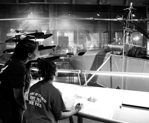
The “Dawn of Racing” section of our new exhibit, Driven to Win: Racing in America, immerses you in an exploration of the early days of racing, using period settings, images, and authentic artifacts. It features two of America’s most significant early race cars.
1901 Ford "Sweepstakes" Race Car

THF90167
Henry Ford only ever drove one race, on October 10, 1901, and that was in the car they called “Sweepstakes.” He certainly was the underdog, but against all odds he won. In Driven to Win, you will discover the innovations that Ford developed for “Sweepstakes” that helped him achieve that remarkable victory. It gave a powerful boost to his reputation, brought in financial backing that helped launch Ford Motor Company, and a few years later, Ford Motor Company put America—and much of the world—on wheels with the Model T.
1906 Locomobile "Old 16" Race Car

THF90188
Driving “Old 16” in the 1908 Vanderbilt Cup race, George Robertson scored the first victory by an American car in a major international auto race in the United States. At that time, the Vanderbilt Cup race was world-famous and highly prestigious, and “Old 16” became known as “the greatest American racing car.” In Driven to Win, you will learn about and see firsthand the expertise, craftsmanship and attention to detail that made this car a winner.
Additional Artifacts

THF154549
Beyond the cars, you can see these artifacts related to early racing in Driven to Win.
- Drop Box Used during the 1904 Vanderbilt Cup Race
- Automobile Racing Goggles, Used by Joe Tracy, circa 1905
- Early Automobile Racing Gloves, circa 1905, Owned by Joe Tracy
- Automobile Racing Face Mask, circa 1905, Owned by Joe Tracy
- Helmet Used by George Robertson in 1908 Vanderbilt Cup Race
- Paperweight Commemorating the 1908 Victory of the Locomobile Company at the Vanderbilt Cup Races
Dig Deeper

Barney Oldfield in "Lightning Benz," Daytona Beach, Florida, March 16, 1910 / THF228867
Learn more about early racing with these additional resources from The Henry Ford.
- Discover the story of racer Barney Oldfield, one of America’s earliest celebrity sports figures.
- Watch our Sweepstakes replica run in Greenfield Village.
- Explore the world of board track racing.
- Learn how Ford Motor Company recognized Henry Ford’s 150th birthday with a custom-painted race car honoring Henry’s win in the Sweepstakes.
20th century, 1900s, racing, race cars, race car drivers, Henry Ford Museum, Driven to Win, cars
Deborah Sussman began her design career as an intern at the Eames Office in 1953. There, over the course of a decade, she was promoted to an art director and worked on graphic design, exhibitions, films, toy design, packaging, and photography. In 1963, she acted as designer for the “Beware of Imitations” image below, with Charles and Ray Eames as creative directors. Appearing as an advertisement in Arts & Architecture magazine, it celebrated Eames-designed furniture produced by Herman Miller. The image is a fascinating herald, hinting at how Sussman’s approach toward the power of large-scale graphics to communicate within environments would define her future vision.
Herman Miller “Beware of Imitations” Advertisement. / THF147716
The foundation image was printed to poster size and affixed to the outside wall of the Eames Office, where it was photographed in situ. The weathered brick wall, scrabbly Californian plant life, and spray-painted stencil additions surrounding the paste-up add texture to the image, revealing it to be evidence of a process. An image at the Library of Congress takes us one step further into this moment, revealing Sussman pasting up the original work. 
Detail. / THF147716
If you look closely toward the bottom left of this image, you will also see a bouquet of flowers on a placard with the text, “Zeeland, Michigan.” Zeeland is, of course, home to the Herman Miller company, but the floral design has its own interesting lifespan. It appears on Herman Miller’s stock certificates and on the underside of a kiosk designed by the Eames Office for the IBM Pavilion at the 1964 New York World’s Fair. Sussman is credited with contributing to both projects. 
Kiosk from the IBM Pavilion at the 1964 New York World’s Fair. / THF156766
Detail of the underside of the IBM Kiosk. / THF171121
Sussman left the Eames Office temporarily to continue her design studies through a Fulbright scholarship in Germany, but was eventually “lured back” to California to work on the Mathematica exhibit. When The Henry Ford acquired the 1964 version of the Mathematica exhibit (now on permanent view in Henry Ford Museum of American Innovation), extensive research was undertaken in the Charles & Ray Eames Papers at the Library of Congress to create the most historically accurate version of the exhibit possible. Photographs at the Library of Congress documented numerous contributions made by women to the exhibit’s design, including Sussman, Ray Eames, and many others. Sussman, for her part, once recounted setting the type for the mathematician biographies that appear on the History Timeline and also appears in a photograph working on the graphics for the base of the Multiplication Cube interactive.
Detail of the Multiplication Cube from the Eames Office-designed Mathematica exhibit. / THF164150
Detail of the History Timeline in Mathematica. / THF170845
In 1968, Sussman formed an independent design practice as Sussman/Prejza & Co. with her husband, Paul. Together they designed things like the “urban branding” for the cities of Long Beach and Santa Monica, California, and wayfinding signage for Walt Disney World and EuroDisney. Her favorite kind of work involved vibrant, larger-than-life graphic and typographic treatments installed in architectural spaces and outdoor urban areas. For this work, she is credited as a pioneer of “environmental design” and “Supergraphics.”
Design Preview / Brand Identity Guidelines for the 1984 Los Angeles Olympics. / THF287946
This approach is especially obvious in her design identity work for the 1984 Los Angeles Olympics. The look and feel of the LA Olympics—created by Sussman/Prejza & C0. in collaboration with the Jerde Partnership—transformed the city of Los Angeles. The holistic plan was for “an energetic montage of color and form [to] appear on everything from tents to tickets.” There were 43 art installations, 28 game venues, 3 Olympic villages, and wayfinding signage. There was a monumental 145-foot tower of colorful scaffolding erected in Exposition Park. Color-coded gateways and walkways lined with concrete “Sonotubes” wrapped in bright abstract graphics. Uniforms for officials and volunteers.
Design Quarterly #127. / THF287955
Detail from Design Quarterly #127. / THF287972
An entire issue of Design Quarterly was dedicated to the project, in which the designers explained their hopes for a successful event as “a modern environment that recalls the imageable qualities of a medieval jousting festival” and one that anticipated that “the city will be transformed overnight, as if an invasion of butterflies has descended upon it.”
Souvenir Street Banner designed by Deborah Sussman for the LA 1984 Olympics. / THF171692
Color played an essential role in unifying the visual language of color, graphics, and typographic treatments. Notably, Sussman broke away from the palette of traditional red, white, and blue, and captured the “Southern California spirit” through shades of vibrant magenta, vermillion, aqua, purple, and sunset orange. A favorite quote in the Design Quarterly issue states: “The glorious colors—the banners, the kiosks and booths, even the trash cans and hot dog napkins—were happily original, all Toyland confetti, in light and airy shades all their own. We get enough of red-white-and-blue everywhere else, don’t we?”
Partial credit to Sussman’s approach can be connected to her early training at the Eames Office, where her mentors emphasized the value of playfulness. There, she had the opportunity to document festivals in other countries. She learned to appreciate folk art and the indigenous cultures of the Pacific Rim. And the “kit of parts” approach to design was part of everyday life at the Eames Office too, which undoubtedly influenced Sussman’s own adaptable “visual alphabet” for the 1984 LA Olympics. Today, her contributions for this and other projects stand as beloved and masterful examples of environmental graphic design. Like many designers who passed through the Eames Office, Deborah Sussman took what she learned, remixed it, and made it an evolved and color-saturated language all her own.
Kristen Gallerneaux is Curator of Communications & Information Technology at The Henry Ford.
California, 1980s, 1960s, 1950s, women's history, sports, Herman Miller, Henry Ford Museum, design, by Kristen Gallerneaux, #THFCuratorChat

Jeanetta Holder with Her Indianapolis 500 Quilt Made for Bobby Unser, 1975-1980 / THF78732
On May 30, 1932, the day that Jeanetta Pearson Holder was born in Kentucky, race cars sped around the track at the Indianapolis Motor Speedway about 250 miles to the north. The timing of Jeanetta’s birth was certainly a hint of things to come: she would grow up with a passion for auto racing, and, as an adult, become that sport’s “Quilt Lady.”
For four decades, Jeanetta combined her love of auto racing and her sewing talents to create unique quilts for winners of the Indianapolis 500 and other auto races.

Dale Earnhardt is wrapped in pride and his quilt after the 1995 Brickyard 400 race at the Indianapolis Motor Speedway. / THF78819
A Love for Racing, A Talent for Sewing
As a little girl growing up on a Kentucky farm, Jeanetta made her own small race cars out of tobacco sticks and lard cans which she “raced everywhere [she] went.” Jeanetta’s childhood creative streak soon extended to sewing. She began to make clothes for her doll—and her pet cat. By the time she was 12, Jeanetta began sewing quilts, filling them with cotton batting from cotton she grew herself.
Jeanetta was clearly “driven.” When she didn’t have a car in which to take her driver’s license test, the teenager borrowed a taxicab. About this same time, Jeanetta started going to the race track. Soon 20-year-old Jeanetta was speeding around an oval dirt track at the wheel of a 1950 Hudson at Beech Bend Park in Warren County, Kentucky. In the early 1950s, women drivers were uncommon—and so was safety equipment. Jeanetta was dressed in a t-shirt and blue jeans for these regional races.
Continue Reading
Indiana, 20th century, women's history, racing, race car drivers, quilts, making, Indy 500, cars, by Jeanine Head Miller
Louis Comfort Tiffany’s glass is part of a larger group that scholars and collectors call Art Glass. Art Glass is generally defined as ornamental and decorative glass dating from the mid-to-late 19th century through the early 20th century. Makers of Art Glass employed newly developed technologies for producing vibrant colors and surface textures. The work of Tiffany is undoubtedly the most well-known, but the beginnings of Art Glass predate Tiffany’s glass work by nearly a decade.
Nineteenth-century Americans were obsessed with showing off their good taste and wealth to family, friends, and neighbors. Conspicuous consumption and ostentatious materialism were bedrock beliefs in Victorian society. Glass for decoration was an important part of the Victorian interior, whether one was wealthy or of modest means. Art Glass, which was less expensive than cut glass, allowed middle-class Americans an opportunity to decorate with style.

Amberina Vase, 1883-1890 / THF163614

Kerosene Lamp, circa 1880 / THF167773
Scholars consider the most successful early Art Glass a product line called “Amberina,” first made by the New England Glass Company (later the Libbey Glass Company) in 1883. It was extremely popular and was widely imitated. Amberina was a relatively simple technique, known to glass makers but only exploited in the 1880s. The glass, which ranges from amber at the bottom to red at the top, is colored with a heat-sensitive gold additive. This shading results from reheating the top part of the glass before allowing it to cool.
Art Glass Goes Big: The Morgan Vase and Its Impact

Peachblow Vase, circa 1886 / THF163612

Peachblow Pear Whimsey, circa 1886 / THF163610
In 1886, an 18th-century Chinese porcelain was part of a highly publicized New York auction of the collection of socialite Mary Morgan. The vase, reputed to be the finest of its kind, sold for a record of $18,000. This unprecedented price made headlines, and soon enterprising glass and ceramic makers began to produce replicas of the vase. First known as “Morgan” vases after Mary Morgan, and later as “Peachblow,” these wares made Art Glass overwhelmingly popular with the public and highly profitable for many firms. Peachblow glass, like Amberina, ranges in colors from dark red to yellow. The most famous maker of Peachblow was J.H. Hobbs, Brockunier, and Company of Wheeling, West Virginia, whose colorations closely imitated the famous “Morgan” Vase.

Agata Tumbler, 1887 / THF163607
The New England Glass Company quickly produced a line called “Agata,” whose color and surface texture closely resembled that of the famous Morgan vase. Agata was difficult to produce and was only made for several years. The New England Glass Company also produced their own version of Peachblow, which they called “Wild Rose,” and collectors call “New England Peachblow.”

Peachblow Vases, 1885-1888 / THF163629

Peachblow Pear Whimsey, 1880-1890 / THF163609
Mount Washington Glass Company Emerges
 Burmese Vase, 1885-1895 / THF163618
The most versatile of Art Glass producers was the Mount Washington Glass Company, located in New Bedford, Massachusetts. Although they created some of the very first Art Glass in the 1870s, they made their name with a line called “Burmese,” first patented in 1885. Like Amberina, Burmese ranges in shades from yellow at the bottom to a pale pink at the top of the piece. Unlike Amberina, it is always opaque. It was produced in both smooth and satin finishes, decorated and undecorated.

Crown Milano Vase, 1888-1893 / THF163595

Crown Milano Vase, 1889-1891 / THF125954
With the success of the Burmese line, Mount Washington Glass Company produced even more ornate lines. They followed up Burmese with their “Crown Milano” line, which featured exotic-looking forms with ornate surface decorations. These would fit perfectly into the décor of an eclectic, late 19th-century American parlor or sitting room.

Royal Flemish Vase, circa 1890 / THF162343
For me, the ultimate in Mount Washington’s ornate Art Glass was their “Royal Flemish” line, dating to the 1890s. The satin glass body is covered with floral gilt decoration and the neck features swirled decoration, culminating in a gold ring at the top.
Tiffany Jumps In

Favrile Toothpick Holder, circa 1895 / THF165617

Favrile Vase, 1901-1915 / THF163631
It was in this environment that Louis Comfort Tiffany started creating Art Glass. In the early 1890s, Tiffany developed a process to imitate the iridescent shimmer of ancient, weathered glass. He patented the process in 1894, which he called “Favrile.” Unlike other Art Glass makers, Tiffany was renowned for creating elegant, yet simple, products as well as grand, large-scale objects like stained glass windows and even interior environments.

Candelabrum, 1903-1919 / THF163661
Tiffany often mixed media, such as the bronze and glass candelabrum above. The sinuous and organic forms are closely related to the international Art Nouveau style, which reached its height of popularity around 1900.

Floor Lamp, about 1900 / THF186205, THF186208, THF186219, THF186215, THF186218
Around 1900, Tiffany started making large scale floor lamps—the one above is one of his first efforts. The fish scale–like shade is composed of his signature Favrile glass, which glows when illuminated. The bronze base features undulating spirals which rise through the lamp’s shaft. The kerosene reservoir is covered with organic S- or wave-like patterns, all of which derive from Tiffany’s Art Nouveau vocabulary.

Electric Table Lamp, 1903–1920 / THF167923
This nature-themed "Daffodil" lamp is the first design attributed to Clara Driscoll, who led the Women’s Glass Cutting Department at Tiffany Studios. Driscoll designed many now-iconic leaded-glass lamps for Tiffany. Driscoll took iridescent Art Glass a step further, echoing nature—in this case daffodils, which she studied in detail while designing this lamp.
Tiffany’s Rivals

Aurene Vase, circa 1920 / THF162344

Aurene Plate, 1920-1929 / THF166928
By the turn of the 20th century, Tiffany’s iridescent Art Glass faced competitors. Foremost among them was the Steuben Company of Corning, New York. “Aurene” was the name that Frederick Carder used for his iridescent Art Glass. When Aurene was first produced, around 1902, Louis Comfort Tiffany sued Carder for copyright infringement. The courts found in favor of Frederick Carder, and Steuben’s Aurene competed with Tiffany’s Favrile glassware. The elegant, floral-shaped vase above combines a cased white outer shell with a dark blue iridescent interior, and may be easily confused with Tiffany’s work.

Lampshades, 1905-1910, Quezal Art Glass and Decorating Company / THF167597
Like Frederick Carder’s Steuben, Quezal features iridescent glass similar to Tiffany’s Favrile. Also like Steuben, Quezal was founded in 1902 in Brooklyn, New York, by a group of Tiffany’s former employees. They produced some of the most vibrant iridescent colors of any of Tiffany’s competitors.

Vase, 1924-1931 / THF166015

Goblet, 1924-1931 / THF167600
One of the most interesting of Tiffany’s competitors was Durand Art Glass of Vineland, New Jersey. Founded at the end of the 19th century, the company developed a distinctive style of Art Glass. By the mid-1920s, they hired workers from the Quezal Art Glass Company, which had recently disbanded. They also hired a glass artist named Emil Larson, who had worked for several Art Glass firms and brought his distinctive feather design to Durand Art Glass.
The End of Art Glass

Favrile Wine Glass, 1918-1924 / THF167662

Favrile Plate, 1918-1924 / THF163653
In 1919, Louis Comfort Tiffany retired and turned his Tiffany Studios over to Arthur Nash, who continued the firm until it closed in 1933. These pieces were designed by Nash and marketed as Favrile glass. Nash maintained the high quality of Tiffany’s output, but times and tastes had changed following World War I. Art Glass was viewed as old-fashioned and part of the Victorian past.
One Last Gasp

Compote, 1931-1935 / THF166002
Following the demise of Tiffany Studios, Arthur Nash was hired by the Libbey Glass Company to design their “New Era” glass line. This ill-fated line was beautiful, but was considered old-fashioned during the early 1930s. This was also the beginning of the Great Depression, so sales were minimal and the line was discontinued by 1935.
Charles Sable is Curator of Decorative Arts at The Henry Ford.
Additional Readings:
- Western Interactions with East Asia in the Decorative Arts: The 19th Century
- "Ocean Floor" Ladder by Therman Statom, 2007
- Now Open: Davidson-Gerson Modern Glass Gallery
- Art Nouveau, Nature, and Louis Comfort Tiffany
20th century, 19th century, Louis Comfort Tiffany, home life, Henry Ford Museum, glass, design, by Charles Sable, art
The unprecedented COVID-19 pandemic that started a year ago—and that we are still living through—is an extraordinarily significant moment in our history. It connects our nation’s past with its present and future—revealing who we were before, who we are today, and who we will become in the future.
As this pandemic began to unfold last year, museums quickly stepped forward to collect—or lay out plans to collect—evidence of it, in many different ways. The majority of these collecting initiatives were local and community-based. Curators at The Henry Ford also developed a plan describing our approach to collecting the COVID-19 pandemic. Like all our collecting plans, it reflects who we are and what we represent as an institution. This begins with our mission statement: The Henry Ford provides unique educational experiences based on authentic objects, stories, and lives from America’s traditions of ingenuity, resourcefulness, and innovation. Our purpose is to inspire people to learn from these traditions to help shape a better future.
Using the filter of the mission statement, The Henry Ford’s approach to collecting the COVID-19 pandemic includes 3D objects, photographs, and archival materials that reflect how we are being innovative, how we are being resourceful, and how entrepreneurs are using their ingenuity to both address people’s needs and remain sustainable. In keeping with the scope of our collections, items must also have national significance. Even if they are local or regional, they should align with broader patterns and national trends.
Currently, we are actively bringing items into the collection that we have saved in our basements over the past year (because of COVID-19 safety protocols), as well as collecting ongoing trends (like vaccine-related items). Here are just a few examples of our collecting to date.

Masking and social distancing quickly became new habits, as seen in these signs from Henry Ford Health System. (Future acquisitions.)
This beaded facemask, created by Diné craftswoman Brighid “Birdie” Pulskamp, features a traditional Navajo Wedding Basket design. / THF186023
Many businesses and services adopted curbside pickup. This sign from the Northville [Michigan] District Library marked where patrons could pick up their online book requests without entering the building. (Future acquisition.)
A parody of the classic Goodnight Moon, Good Morning Zoom was created to help kids make sense of the changes in their world brought on by the pandemic. (Future acquisition.)
This wooden ornament references the shortage of toilet paper that occurred in the pandemic’s earliest days, making it a highly sought-after commodity. (Future acquisition.)
Holiday traditions took on new twists, such as this drive-thru Santa event in Bay City, Michigan. (Future acquisition.)
A facemask can be found for every holiday and occasion. (2020.104.2)
Throughout the pandemic, Dr. Anthony Fauci has been one of the most prominent medical voices updating the public on the fight against the virus. As early as April 2020—when the National Bobblehead Hall of Fame released this tribute—he was already viewed as a hero by many. (Future acquisition.)
Ford and subsidiary Troy Design & Manufacturing Company (TDM) converted Ford Transit vans into mobile COVID-19 testing units. Starting in April 2020, they took tests to health care workers and first responders—people who didn’t have to time to travel to a lab. Each van could test up to 100 people a day, and results were returned within 24–36 hours. Within a few months, the mobile testing program was extended to nursing homes, substance abuse centers, and community shelters. (2020.124.1)
Early in the pandemic, hospitals depended on scarce ventilators to treat patients with the most serious infections. Ford Motor Company employees built more than 51,000 ventilators at the Rawsonville Components Plant between April and August 2020. This unit, the last one off the assembly line, was signed by some of the 1,100 people involved in the effort. / THF185919
Health worries added to security concerns at the inauguration of President Joe Biden and Vice President Kamala Harris on January 20, 2021. Ford produced 15,000 single-use face masks and donated them to ceremony attendees. Employees at Hatteras, Inc., who printed inauguration logos on the masks, worked around the clock to get them shipped to Washington and inspected by the Secret Service in time. (2021.19.6)
Ford subsidiary TDM manufactured more than five million face shields. Elastic, to hold the shield securely on the wearer’s head, was in short supply. TDM instead used flexible automobile weather stripping, pinned to the shield with automotive fasteners. / THF185929
Disposable face masks, made at Ford’s Van Dyke Transmission Plant, were distributed free of charge to underprivileged communities, schools, food banks, and military veterans. The automaker set a goal to produce 100 million masks through 2021. / THF185913


Produced through the Amplifier Foundation, these posters acknowledge the heroic efforts of healthcare workers, and offer encouragement in the midst of upheaval. / THF621827, THF621829, THF621843
We continue to work through additional donations offered to us by the public; for more information on how to contribute to this collection, visit The Henry Ford - COVID-19 Collections. You can also see more pandemic-related artifacts in our Digital Collections, and read additional stories related to the many impacts of the COVID-19 pandemic on our blog.
Donna Braden is Senior Curator and Curator of Public Life at The Henry Ford. Rachel Yerke is Curatorial Assistant at The Henry Ford.
21st century, 2020s, manufacturing, home life, healthcare, Ford Motor Company, COVID 19 impact, by Rachel Yerke, by Donna R. Braden
The Henry Ford’s archives contain a great deal of material about radio and television shows produced or sponsored by Henry Ford and Ford Motor Company. Here is just a small sampling of the types of items and shows covered.
Henry Ford began broadcasting over his WWI radio station in 1922. Early broadcasts featured musical acts from company bands, such as the Ford Motor Company Band and the Ford Hungarian Gypsy Orchestra. Later broadcasts expanded the talent pool to acts across the United States, including singers, bands, soloists, and even the California Bird Man.
Ford Motor Company Radio Station WWI, Dearborn, Michigan, February 1924. / THF134739
The Ford Sunday Evening Hour was a popular radio show produced by Ford. This show was broadcast from 1934–1942 (and then again from 1945–1946). The show was performed live in Detroit, first at Orchestra Hall and then at the Masonic Temple, and broadcast over the CBS radio network. Musical pieces were played by 75 members of the Detroit Symphony Orchestra under the name the Ford Symphony Orchestra, with each show featuring guest star soloists and singers.
Ford Sunday Evening Hour program, October 7, 1934. / THF137776
Ford Sunday Evening Hour Dealer Display, 1938. The program was broadcast across the U.S. and was advertised by Ford dealers all over the country. / THF269154
In the summer, the Ford Summer Hour offered lighter, more popular tunes. This program used a smaller 32-piece orchestra and sometimes featured Ford employee bands such as the River Rouge Ramblers and the Champion Pipe Band.
The Ford Summer Hour poster, 1939. / THF111542
Ford Summer Hour program, August 24, 1941. / THF134690
Ford Motor Company sponsored their share of television programs in the 1940s and 1950s as well. The Lincoln-Mercury division sponsored Toast of the Town, later The Ed Sullivan Show. The archives holds this scrapbook of reviews of the first season of the show (or shew) in 1948.

Toast of the Town scrapbook, 1948-1949. / THF622224, THF622504
The 50th anniversary of Ford Motor Company in 1953 was a big celebration. Paintings were commissioned by Norman Rockwell to depict the company history, calendars were assembled, banquets and celebrations were planned worldwide, and the company put together a TV special to celebrate its 50-year history.
Advertisement, "Ford 50th Anniversary Show," June 15, 1953 / THF622247
The TV program featured many well-known performers, many of whom signed Benson Ford’s personal copy of the script.

Script for the Ford Motor Company 50th Anniversary TV Show, Broadcast June 15, 1953 / THF622239, THF622240
These are only a few of the radio and TV shows produced or sponsored by Ford over the years. The archive at the Benson Ford Research Center has additional material, including scripts, ratings, and public relations analysis reports, for several of these shows. Some of these items may be viewed in our Digital Collections, while others have yet to be digitized. While the reading room at the Benson Ford Research Center remains closed at present for research, if you have any questions, please feel free to email us at research.center@thehenryford.org.
Kathy Makas is Reference Archivist at The Henry Ford. This post is based on a February 2021 presentation of History Outside the Box as a story on The Henry Ford’s Instagram channel.
Dearborn, Michigan, Detroit, archives, TV, music, radio, Ford Motor Company, by Kathy Makas, History Outside the Box
This is the first of a series of blog posts presented in conjunction with the traveling exhibition, Louis Comfort Tiffany: Treasures from the Driehaus Collection. The exhibit, consisting of approximately 60 artifacts, is on view at Henry Ford Museum of American Innovation from March 6, 2021, through April 25, 2021. All of the objects shown here are from the collections of The Henry Ford and provide background on themes in the exhibition.
In the 1890s, artists and designers in Europe and the United States attempted to create a modern aesthetic for the emerging 20th century. This aesthetic was consciously modern. The decorative style that emerged, Art Nouveau, featured bold color contrasts and organic lines, sometimes flowing gracefully and sometimes sharply undulating, like a whiplash. Artists and designers associated with this trend looked to nature as their guide. As they often said, there is nothing historical about nature, it is universal.
Bookplate Designed by Rene Lalique for Emilie Grigsby, 1890-1905 / THF291251
This bookplate, created by French designer Rene Lalique, is derived almost purely from nature, although the floral forms are abstracted into sinuous and linear elements that we associated with French Art Nouveau of the 1890s and early 1900s. Even the letters of the name, “Emilie,” are rendered into organic shapes.
Japanese Travelers in a Snow Storm, 1900-1929/ THF292633
Increased communication and trade with Asia in the second half of the 19th century brought new design inspiration to Europe. Japanese woodblock prints particularly appealed to Art Nouveau poster and decorative designers, who incorporated asymmetry and contrasting colors in their own work. Notice the unmodulated areas of light colors against dark colors, which create pictorial depth.
Bookplate of Georges Goury, 1900-1910/ THF291287
A major element of the Art Nouveau style, the sensual female figure was popularized by French poster artists like Jules Cheret and Alphonse Mucha. The illustrator of this Art Nouveau bookplate placed a woman at the center, used diagonal lines to create an illusion of depth (a technique derived from Japanese prints), and added stylized botanical motifs to frame the image.
Harper's Bazar Thanksgiving, Number 1895 / THF292639
Art Nouveau in America came first as imported graphic art printed in Europe for an international audience. American illustrators, like the young Will Bradley, adapted these design elements for their illustrations in magazines and advertising posters. This poster promotes the Thanksgiving issue of the magazine Harper’s Bazar (which would later become Harper’s Bazaar) and appeared on newsstands in American cities from coast to coast. This poster is full of harvest and Thanksgiving symbols: the sheaf of wheat and the subtle turkey, suggesting the bounty of the season. The Art Nouveau elements include the organic whiplash floral forms and the female figure predominating the scene.
Favrile Toothpick Holder, circa 1895 / THF165617
In the 1890s, American designer Louis Comfort Tiffany developed a process to imitate the iridescent shimmer of ancient, weathered glass. His "Favrile" line of art glass included organic forms characteristic of the Art Nouveau style, sometimes featuring abstract ornamentation, such as the design on this toothpick holder.
Favrile Vase, 1901-1915 / THF163631
Tiffany’s small vase expresses the Art Nouveau trademark element of the peacock feather, which, like many Art Nouveau elements, has its roots in European design. Tiffany was renowned in America and Europe for developing the Art Nouveau into elegant, yet simple, products, as well as grand, large-scale objects like stained glass windows and elaborate electric lighting.
Candelabrum, 1903-1919 / THF163661
Louis Comfort Tiffany gained international acclaim, exhibiting his work in metal, glass, and jewelry alongside European Art Nouveau designers in Paris as early as 1895. The sinuous, plant-like design of this high-end glass and metal Tiffany candelabrum exemplifies the Art Nouveau style.
Tiffany Studios made a great variety of candleholders for upper middle-class clients. This model is described in the 1906 catalogue as simply, "6 lights, in a row, extinguisher on stem." The customer could choose from 11 designs of "candlestick tops," or standard interchangeable sockets, that were listed and priced separately. These included "long" or "short" metal or glass and metal tops in a variety of forms.
Floor Lamp, about 1900 / THF186205, THF186208, THF186219, THF186215, THF186218
Around 1900, Tiffany started making large scale floor lamps—this is one of his first efforts. The fishscale-like shade is composed of his signature Favrile glass, which glows when illuminated. The bronze base features undulating spirals which rise up through the lamp’s shaft. The kerosene reservoir is covered with organic S- or wave-like patterns, all of which derive from Tiffany’s Art Nouveau vocabulary.
Electric Table Lamp, 1903-1920/ THF167923
Louis Comfort Tiffany became known for applying Art Nouveau aesthetics to lighting products. This nature-themed "Daffodil" lamp is the first design attributed to Clara Driscoll, who led the Women’s Glass Cutting Department at Tiffany Studios. Driscoll designed many now-iconic leaded-glass lamps for Tiffany.
Aurene Vase, circa 1920 / THF162344
“Aurene” was the name that Frederick Carder used for his iridescent art glass at the Steuben Glass Works in Corning, New York. When Aurene was first produced, around 1902, Louis Comfort Tiffany sued Carder for copyright infringement. The courts found in favor of Frederick Carder and Steuben’s Aurene competed with Tiffany’s Favrile glassware. This elegant, floral-shaped vase combines a cased white outer shell with a dark blue iridescent interior and comes directly from the Art Nouveau vocabulary found in Tiffany’s production.
Martele Pitcher, 1898-1905 / THF129337
Like Steuben, the Gorham Silver Company of Providence, Rhode Island, produced its own line of Art Nouveau–inspired wares. Called Martele, meaning hand-hammered, this was one of Gorham’s high-end lines. This pitcher shows an organic swirl of motion, presumably sea water, with an octopus placed asymmetrically across the surface.
Handbag, circa 1900 / THF175168
By the turn of the century, well-heeled consumers could choose from an array of luxury goods in the Art Nouveau style. This handbag features classic Art Nouveau motifs: botanical elements, curved lines, and a peacock, whose fanned tail feathers dominate the center of the design.
Wilton Rug, circa 1900 / THF175015
In the first decade of the 20th century, the Art Nouveau style began to filter through many levels of American society. This Wilton rug is a good example, as it features characteristic elements of Art Nouveau design: striking color combinations, undulating "whiplash" lines, and stylized botanical motifs.
"Electrical Apparatus and Supplies for Isolated Plants," June 2, 1902 / THF267443
The explosion of the electrical industry in the 1890s generated new design needs. Electrical corporations hired artists working in the style of the day—Art Nouveau—to design their buildings, products, and communications. These partnerships marked the beginnings of industrial design.
Sterne's Deodorizing Toilet Soap, 1900-1915 / THF175155
Art Nouveau reached its peak of popularity in 1900, but American manufacturers incorporated echoes of the style in products and product packaging into the 1910s. The Art Nouveau styling of the label for this everyday product—a bar of soap—would have appealed to many consumers.
By 1914, the Art Nouveau style was considered old-fashioned. Most European and American designers had moved on with their work. Tiffany was the rare exception. Tiffany Studios continued producing Art Nouveau–inspired lamps, vases, desk sets, and windows through the 1920s. Tiffany retired from day-to-day management in the early 1920s. It took until the Great Depression struck in 1929, and Tiffany’s death in 1933, for the firm to cease production.
Charles Sable is Curator of Decorative Arts at The Henry Ford.
Additional Readings:
- Davidson-Gerson Modern Glass Gallery
- "Summer Bouquet with Honeybees" by Paul J. Stankard, 2004
- "Candy Apples in Green, Red, and White" by Richard Ritter, 2008
- Behind the Scenes: Conservation of Our Tiffany Kerosene Floor Lamp
nature, Henry Ford Museum, Louis Comfort Tiffany, design, home life, glass, by Charles Sable, art

Illustration by Sylvia Pericles.
Welcome to the digital era. Now what?
In the fall of 2020, for the first time, an entire generation started school on a screen. As the new coronavirus abruptly cut many of us off from the world outside our homes, for those of us fortunate enough to enjoy digital communication tools, the Internet has become one of the most essential tools for surviving the COVID-19 pandemic. As sci-fi and scary as this may seem, there is also an opportunity here to transform—again—the Internet.
As COVID-19 continues to dramatically upend our lives, an ever-evolving digital world pushes us to rethink the purpose of the Internet and challenges us to re-create our digital and political lives as well as the Internet itself. The challenge is ensuring that all people will have the skills, knowledge and power to transform the Internet and shift its dependence on a commerce- and clickbait-driven economic model to become instead a universally guaranteed utility that serves people’s needs and allows creativity to flourish.
Societal Reflection
This challenge has been a long time coming. Before the COVID-19 pandemic, the Internet was on questionable ground. In early 2020, misinformation campaigns, privacy breaches, scams, and trolls proliferated online. When COVID-19 hit and the world was forced to shift the important tasks of daily life online, we saw (again) how digital inequalities persist—forcing poor and vulnerable communities to rely on low-speed connections and cheaper devices that can’t handle newer applications.
The Internet is a reflection of who we are as a society. We know that there are people who scam and bullies who perpetuate injustice. But there is also beauty, creativity, and brilliance. The more perspectives there are shaping this digital era, the more potential we have to tap the best parts of us and the world.
There is no silver bullet that will keep violence or small-mindedness at bay—online or off—but I know from 13 years of working on digital justice in Detroit that teaching technology is the first step toward decolonizing and democratizing it.
A City’s Story
Over the years, Detroit has faced many economic hardships, which has meant that digital access has too often taken a back seat. Bill Callahan, director of Connect Your Community 2.0, compiled data from the 2013 American Community Survey and found that Detroit ranked second for worst Internet connectivity in the United States.
Following that report, in 2017 the Quello Center of the Department of Media and Information at Michigan State University reported that 33% of Detroit households lacked an Internet connection, fixed or mobile. Yet the world had already moved online.
By 2011, many government agencies had transitioned away from physical spaces, making social services only accessible via the Internet. My colleagues and I at Allied Media Projects (a nonprofit that cultivates media strategies for a more just, collaborative world) understood that access to and control of media and technology would be necessary to ensure a more just future. As Detroiters, we needed to figure out how to create Internet access in a city that was flat broke and digitally redlined by commercial Internet providers. We also needed to address the fact that many Detroiters who had never before used digital systems had a steep learning curve ahead of them.
The question we asked our communities, and answered collectively, originated from and addressed Detroit’s unique reality: What can the role of media and technology be in restoring neighborhoods and creating new economies based on mutual aid?

Illustration by Sylvia Pericles.
To answer this question, the concept and practice of community technology—a method of teaching and learning technology with the goals of building relationships and restoring neighborhoods—emerged. If we want to harness the potential of the digital future ahead of us, we need to reshape our current relationships with the digital world. We need to understand how it works, demand our rights within it, and be aware of how digital tools shape our relationships with each other and with the larger world. Ultimately, the goal of community technology is to remake the landscape of technological development and shift the power of technology from companies to communities. The place where this begins is by rethinking our digital literacy and tech education models.
Community technology is inspired by the citizenship schools of the Civil Rights movement. Founded by Esau Jenkins and Septima Clark on Johns Island, South Carolina, in the 1950s, citizenship schools taught adults how to read so that they could pass voter-registration literacy tests. But under the innocuous cover of adult-literacy classes, the schools actually taught participatory democracy and civil rights, community leadership and organizing, practical politics, and strategies and tactics of resistance and struggle.
I saw a through line from the issues that encouraged citizenship schools to emerge in the 1950s to the struggles that Detroit faced in the early 2000s. In the 21st century, communities with high-speed Internet access and high levels of digital literacy enjoyed a competitive advantage. The denial of these resources to low-income and communities of color compounded the existing inequality and further undermined social and economic welfare in those neighborhoods.
Like the citizenship schools, community technology embraces popular education, a movement-building model that creates spaces for communities to come together in order to analyze problems, collectively imagine solutions, and build the skills and knowledge required to implement visions. This educational model structures lessons around the goal of immediately solving the problem at hand. In the citizenship schools, lessons were planned around the goal of reading the U.S. Constitution. Along the way, participants developed the profound technical and social skills needed to solve the problem.
In 2008, when I first started teaching elders in Detroit how to use and understand the Internet, it was always hard to know where to start. There were so many things to do online. The first question I asked was: “What do you wish you could do with the Internet?” Oftentimes, folks wanted to be able to view images of their grandchildren that had been sent to their email, or they would want to communicate with loved ones across the seas. It would be nearly impossible for me to teach a class that attended to all of those individual needs while keeping everyone engaged.
I wondered: If I taught problem-solving rather than teaching technology, could I support the same elder who couldn’t view a digital photo of their grandchild to build and install Wi-Fi antennas and run an Internet service provider (ISP) in their neighborhood?
As impossible as that may sound, it worked. In 20 weeks, I saw former Luddites work with their neighbors to build wireless networks. This curriculum went on to shape the Equitable Internet Initiative, which has trained over 350 Digital Stewards throughout Detroit, New York, and Tennessee.

Illustration by Sylvia Pericles.
Digital Liberation
Over the eight years I ran the Digital Stewards Program, what I realized is that relevance can engage someone to learn, but curiosity is what cultivates the kind of lifelong learning that leads to liberation.
Citizenship schools remind me that liberation is not a product of having learned a skill but rather the continued ability to participate in and shape the world to meet your and your communities’ needs. Becoming a lifelong learner of technology—and aspiring constantly to use it for liberatory ends—is essential because technology is constantly changing.
Every software program I ever learned in college is now obsolete. To meaningfully participate in the digital era, we need to be able to adapt technology to meet our needs rather than change ourselves to adapt to new technologies.
In order to cultivate the agency and self-determination necessary to rescue this digital era from corporations and trolls, we will need to change how we as a society pass on knowledge and how—and for whom—we cultivate leadership and innovation. Too often, technological knowledge is presented as a pathway for individual advancement through participation in a digital economy that further consolidates power and wealth for corporations. During this time of physical isolation, how do we change the experience of being forced into endless video meetings and classrooms into something more like inhabiting and co-creating a digital commons? Can we create environments that allow people to engage with technology from a community context rather than as distanced individuals stuck staring at our screens?
The Internet’s culture is currently being shaped by corporations. Social media platforms, ISPs, and algorithms control our movements through almost all online space. Can we remake the Internet into a community that we can all inhabit, and move away from the metaphor of the Internet as an information superhighway? Perhaps we can begin to build the equivalent of sidewalks, public parks, and bike lanes.
As a generation faces an unprecedented year of school online, we would be wise to realize that this is an opportunity for all of us to learn together and become both more critical of how we engage technology and more aware of what we see is lacking. How do we want to form a community online, navigating, creating, and adapting online spaces for our collective survival?
Perhaps, unwanted though it is, the global pandemic can inspire us to finally create a digital world that is befitting of our time and presence there—and can inspire the justice, equality, and hope that our IRL world so badly needs right now.
This post was adapted from an article by Diana J. Nucera that originally appeared in the January–May 2021 issue of The Henry Ford Magazine. Nucera, aka Mother Cyborg, is an artist, educator, and community organizer who explores innovative technology with communities most impacted by digital inequalities. Post edited by Puck Lo; illustrations by Sylvia Pericles.
Civil Rights, education, COVID 19 impact, Michigan, Detroit, women's history, African American history, technology, by Diana J. Nucera, The Henry Ford Magazine
 Nude is Not a Color quilt, made by Hillary Goodwin, Rachael Dorr, and contributors from around the world, 2017. / THF185986
We often associate quilts with warmth and creativity. They can also make statements —serving as banners advocating a cause.
For nearly 200 years, American women have used needle and thread—once the only medium available to them—to express opinions, raise awareness, and advocate for social change. Women gathered in homes and in their communities to create quilts supporting causes like abolition, voting rights for women, and war relief.
This striking quilt, Nude is Not a Color, was created in 2017 by a worldwide community of women who gathered virtually to take a stand against racial bias. Learn more about the quilt below, and see it for yourself on exhibit as part of What We Wore in Henry Ford Museum of American Innovation, from March 11 through April 18, 2021.
The Quilt’s Story
In 2014, a clothing brand that sewist and blogger Bianca Springer of Pearland, Texas, had publicly supported introduced a new line of pale beige garments called Nude—a name long used by the fashion and cosmetic industries for products like hosiery and lipstick. Bianca took action. She contacted the company, thinking that the name was perhaps an oversight —reminding them that “nude” is a state of undress, not a color. And that the shade they chose as “nude” reflected only people of lighter skin tone—thus marginalizing people of color. Bianca’s perspective was repeatedly dismissed by company officials as overblown and irrelevant. She felt excluded and invisible.
Quiltmaker Hillary Goodwin of Auburn, California—also a fan of the company's clothing designs—wanted to stand in solidarity with her friend Bianca, and with other people of color. Together they decided to make a statement in fabric. Through Instagram, Hillary asked quilters to create a shirt block in whatever color fabric they felt best represented their skin tone, or that of their loved ones. Twenty-four quilters responded, from around the United States and around the world, including Canada, Brazil, the United Kingdom, Spain, the Netherlands, and Australia. Hillary then combined these shirt blocks with an image of Bianca wearing one of the “Nude” brand garments—creating this motif of a woman of color clothed in many shades of “nude.” Rachael Dorr of Bronxville, New York, then free-motion machine-quilted the completed quilt top.
More people became aware of the company’s bias and lent their voices to the issue, demanding change—and the brand eventually altered the name of the garment collection. A global community of women, willing to use their talent and voices to take a stand against racism, made a difference.
Quilt Contributors
*Designed and constructed by Hillary Goodwin, Auburn California
*Design assistance by Robin King, Auburn, California
*Paper-pieced shirt pattern designed by Carolyn Friedlander, Lake Wales, Florida
*Shirt blocks contributed by:
- Carmen Alonso, Oviedo, Spain
- Agnes Ang, Thousand Oaks, California
- Berene Campbell, North Vancouver, British Columbia, Canada
- Kirsty Cleverly, Sunshine Coast, Queensland, Australia
- Silvana Pereira Coutinho, Brazil
- Anne Eriksson, Egmond aan den Hoef, The Netherlands
- Hillary Goodwin, Auburn, California
- Rebecca Green, United Kingdom
- Lynn Carson Harris, Chelsea, Michigan
- Phoebe Adair Harris, Chelsea, Michigan
- Krista Hennebury, North Vancouver, British Columbia, Canada
- Sandra Johnson, Orange, California
- Chawne Kimber, Easton, Pennsylvania
- Tamara King, Portland, Oregon
- Alexandra Ledgerwood, Kansas City, Missouri
- Maite Macias, Oviedo, Spain
- Nicole Neblett, Ann Arbor, Michigan
- Krishma Patel, Carteret, New Jersey
- Amy Vaughn Ready, Billings, Montana
- Sonia Sanchez, Oviedo, Spain
- Rachel Singh, Seattle, Washington
- Michele Spirko, Amherst, Massachusetts
- Bianca Springer, Pearland, Texas
- Jess Ziegler, Adel, Iowa
*Free-motion machine quilted by Rachael Dorr, Bronxville, New York
Maker Stories
The makers each had a unique story to tell—below are some of their insights.
“Hearing of this encounter was an eye opener for me as a white woman. How would I feel if I had to explain to my daughter that her skin tone was not the “standard”? How many other ways does my white privilege benefit me without me acknowledging it? How could I help stand in solidarity with my friend?” —Hillary Goodwin, Auburn, California
“The … collection featured a non-diverse group of models wearing beige fabrics classified as "nude.” My "nude" skin is not beige and the use of the term made it clear they did not have me in mind… the color … only fits the white majority, signals white supremacy and marginalizes people of color… With the conceptualization of the quilt, the issue went from commiseration and emotional processing of systemic and overt racism, to a broader statement of activism.” —Bianca Springer, Pearland, Texas
“Although I considered myself a non-racist white person, I am not, of course, and I had never really given any thought to what it felt like to live life in a skin color that was not white. I credit my participation in the making of this quilt as the beginning of my slow and never-ending quest to be an anti-racist ally and to use the unearned privilege afforded me solely by my skin color to help bring some long overdue justice to this country.” —Tamara King, Portland, Oregon
"We are a group of three friends, we met through sewing… We live in Asturias, a small region in the north of Spain, that has traditionally been a land of emigrants … concepts such as "white privilege,” "black lives matter" … "segregation" ... sound very foreign to us… Choosing the fabrics for our "shirts" was … a surprise. How different we all are! And then seeing all the "shirts" … Mind blowing!” —Sonia Sanchez (along with friends Carment Alonso and Maite Macias), Oviedo, Spain
“I hope that the message of the quilt reaches a lot of people and, at least, has them thinking.” —Kirsty Cleverly, Sunshine Coast, Queensland, Australia
“I grew up in the South at a time when bare legs were scandalous and pantyhose were expected on any good young lady. The color options were black, suntan, and nude. It never quite made sense why nude was so white and why my own predominant skin tone was equated to someone's suntan. Why would white skin be the default in such a creative industry as fashion? Unfortunately the industry still adheres to these color naming schemes, which only serve to make sure I know that I am Other in this society.” —Chawne Kimber, Easton, Pennsylvania

“My daughter, Phoebe, who was 10 at the time, often spent time in my sewing room with me and loved to help choose fabrics for my projects. I had Phoebe help choose a fabric that matched my skin tone. She noticed that HER skin matched a different color and wanted to contribute a block too. I loved that teachable moment we had in the sewing room… This moment contributed to her journey of looking at how people are the same, how people are different, representation, and fighting for social justice as she is now doing in her teens.” —Lynn Carson Harris, Chelsea, Michigan
“I am familiar with the disappointment when undergarments, hosiery, foundation creams made in cream/pink aka “nude" never quite match my more yellow/olive skin tone. Working with quilting cotton solids in skin tones that ranged from rich chocolate to yellow undertones was liberating as it helped me be more comfortable challenging the current paragon for skin tone.” —Agnes Ang, Thousand Oaks, California
“I was born into a white, middle-class family in South Africa during the sixties. When you live in a life where everyone looks and lives like you do, you come to believe that this is normal life, however of course, this is far from the truth. Despite my family being liberal, I was blind as to the impact that my privilege had had on the black communities around us… I have become more aware of this burden of my privilege on others… The simple awareness of how our world is designed for some but not all, should inspire us to make equitable changes to provide dignity for all. Inclusivity and raising each other up makes us a strong human race.” —Berene Campbell, North Vancouver, British Columbia, Canada
“As an Asian Indian couple, a job move for my husband brought us to USA in 2001. Within a short time the unfortunate events of 9/11 occurred. Watching the morning news live, I saw the first tower being struck and a few minutes later the second! All telephone systems were down and I was not able to contact my husband… Fearing the worst possible harm to my husband, I panicked! I knocked on my neighbor’s door. We had shared the elevator a few times. All I wanted to know from her was, how far or near my husband’s workplace would be to the Twin Towers. She opened the door, took one look at me and yelled into my face, ‘Go back to wherever you came from, you [n-word]!’” —Krishma Patel, Carteret, New Jersey
“As a new grad and a South Asian female when I first went to work in investment banking I needed stockings to go with my business attire. I would always find loads of "Nude" colored stockings but they never kind of matched my skin color. A few stores would only carry that color and I had to go find specific stores that sold the ones matched my complexion.” —Rachel Singh, Seattle, Washington
“People like me with brown skin are thus ignored and rendered invisible. And yet, we exist and we matter. I contributed to this quilt to join with others who also believe that nude is not a color. I contributed two shirts: one shirt is the color of honey and the other cocoa brown. These shirts represent each of my brown-skinned daughters. May they never feel invisible. May they always know that their color of nude is just as worthy and beautiful.” —Nicole Neblett, Ann Arbor, Michigan
“…people of color face a world frequently viewed only through the white lens, while white people have blinders on to that experience… I’m proud to be part of this project and hope it inspires white viewers to open their hearts and minds to the anti-racism work we must continue to do for the sake of all humanity.” —Michele Spirko, Amherst, Massachusetts
Jeanine Head Miller is Curator of Domestic Life at The Henry Ford. All quilt contributor images from the collections of The Henry Ford.
21st century, 2010s, women's history, What We Wore, quilts, making, Henry Ford Museum, fashion, by Jeanine Head Miller, art, African American history

Lyn St. James, photographed by Michelle Andonian, 2008 / THF58574
Racing Career
Lyn St. James was watching from afar when Janet Guthrie was trying to break into Indy car and stock car racing. At the time, St. James was a part-time competitor chasing a Sports Car Club of America road-racing national championship in a Ford Pinto.
“I was excited and pumped about my racing, and I watched her on the television and thought, ‘God, she’s struggling and nobody wants her there,’” St. James recalled. “She didn’t smile very much, and it made me say, ‘Why would I want to do that? Why would I want to put myself in that kind of situation when I was having so much fun?’”

This racing helmet worn by Lyn St. James is going on display in Driven to Win: Racing in America. / THF176437
In the early 1980s, Kelly Services sponsored the International Motor Sports Association (IMSA) American Challenge championship and paid bonuses to female drivers. St. James parlayed an opportunity in that series, along with a chance encounter with legendary Ford executive Walter Hayes, into a highly successful relationship with Ford that produced six wins in IMSA competitions, including class victories at Daytona and Sebring, prior to shifting her focus to Indy cars. She is also the only woman to win an IMSA GT race driving solo.

Lyn St. James at IMSA, Watkins Glen, NY, 1985 / THF69459
“I wanted to test-drive one, just to experience the peak of race car performance,” she said. “I was just in heaven. I had set speed records in a stock car at Talladega, and in comparison, it felt numb. Dick Simon [IndyCar team owner] was very supportive, and that was a turning point. I wrote to 150 companies over four years seeking support. J.C. Penney was the 151st, but the first one that said yes.”
Finally, in 1992, St. James became the first woman to qualify for the Indianapolis 500 since Guthrie last had, 15 years earlier. St. James finished 11th in the race, claiming Rookie of the Year honors (the first woman to do so). In 1994, she out-qualified reigning Indy car champion Nigel Mansell at Indy; she made a total of seven Indianapolis starts, with her last in 2000. She has been inducted into the Sports Car Club of America and the Florida Sports halls of fame, and held 21 international and national closed-circuit speed records over a 20-year period.

Lyn St. James’s Indy 500 history from 1992 to 2000. / THF284826
Mentor of Motorsports
St. James still occasionally competes in vintage races, and in addition is a speaker, author, philanthropist, and coach, but spends most of her time mentoring female drivers. Her foundation’s driver development program has graduated more than 230 participants over the last 25 years, including then-future Indy car drivers Sarah Fisher and Danica Patrick.

Lyn St. James at her Complete Driver Academy, which provided a comprehensive education and training program for talented women race car drivers who aspired to attain the highest levels in motorsports, in Phoenix, Arizona in 2008 (photograph by Michelle Andonian). / THF58682
“It’s sad that leaders in motorsports have not figured out that the car levels the playing field for everyone,” St. James said. “The leaders have missed an opportunity to show how female involvement in racing really represents society. Women can perform and compete on an equal level.”
Involvement with The Henry Ford and
Driven to Win
In 2008, a small crew from The Henry Ford traveled to Phoenix, Arizona, to visit a race car driver academy for women. The institution, called Complete Driver Academy, was established by Lyn St. James in 1994 to help identify potential champion female drivers and provide the tools they needed to further their careers. The Henry Ford interviewed St. James there as part of its Visionaries on Innovation collection of video interviews, which also features other racing legends such as Mario Andretti.

Lyn St. James’ 1992 Indianapolis 500 "Rookie of the Year" trophy will be on exhibit in Driven to Win. / THF176451
In addition to documenting St. James’ oral history, The Henry Ford has many artifacts from her racing career in its collections—some of which will be on display in the new Driven to Win: Racing in America permanent exhibition in Henry Ford Museum of American Innovation, where St. James is a showcased driver. “Lyn has been an adviser to the exhibit going back more than ten years,” said Curator of Transportation Matt Anderson. “From the start, she has offered her help and advice, including connecting us with innovators like motorsports training expert Jim Leo of PitFit Training in Indiana.”
Among the racing-related artifacts from St. James that will be on display in Driven to Win: her helmet, driving suit, HANS (head and neck support) device, and Rookie of the Year trophy from the 1992 Indy 500, where she became the first woman to win that title. You can also explore many more artifacts related to St. James’ career in our Digital Collections.
This post was adapted from an article by John Oreovicz that originally appeared in the January–May 2020 issue of The Henry Ford Magazine.
Indiana, 21st century, 20th century, women's history, The Henry Ford Magazine, racing, race car drivers, Indy 500, Henry Ford Museum, education, Driven to Win, cars, by John Oreovicz