Pattern, Paint, and Peacocks: An Introduction to the Whimsical Art of the Pennsylvania Germans at The Henry Ford
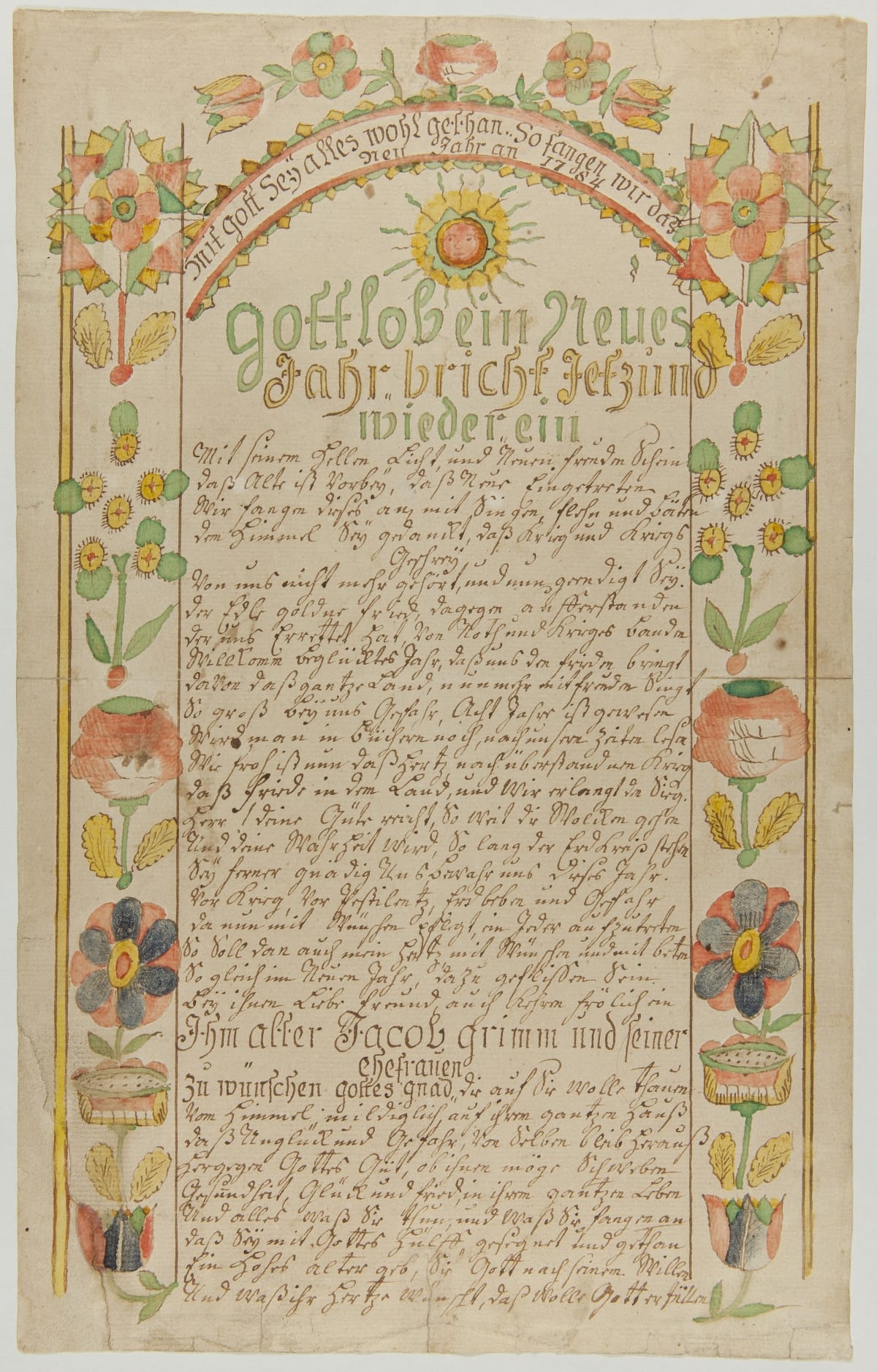
New Year’s Wish for Jacob Grimm and Family, 1784, made by Daniel Schumacher (active 1728-1787), worked in Berks, Lehigh, and Northampton Counties. 61.148.1 / THF237518
The Pennsylvania Germans, popularly known as the Pennsylvania “Dutch” (a corruption of the German word “Deutsche,” which literally means German) were a vibrant immigrant community active in southeastern Pennsylvania in the late 18th and early 19th centuries. By 1790, they made up about forty percent of the population and vied with those of British ancestry as the largest ethnic group. Even in urban areas, such as Lancaster and Philadelphia, the Germans were a sizeable minority.
Within the community itself there was great diversity, although many immigrated from the Palatinate area of southwestern Germany and approximately ninety percent were Protestants, with only ten percent Catholics.
What is remarkable about their legacy is their flamboyant, whimsical, playful, and highly imaginative folk art. They loved to decorate just about every type of household object, from small-scale items like ceramics to large-scale pieces like furniture, with instantly recognizable images. These artists are the most renowned among folk art collectors for their illuminated manuscripts, including marriage and birth certificates, family registers—essentially any type of recorded document. These pieces are called Fraktur.
The Compositions:
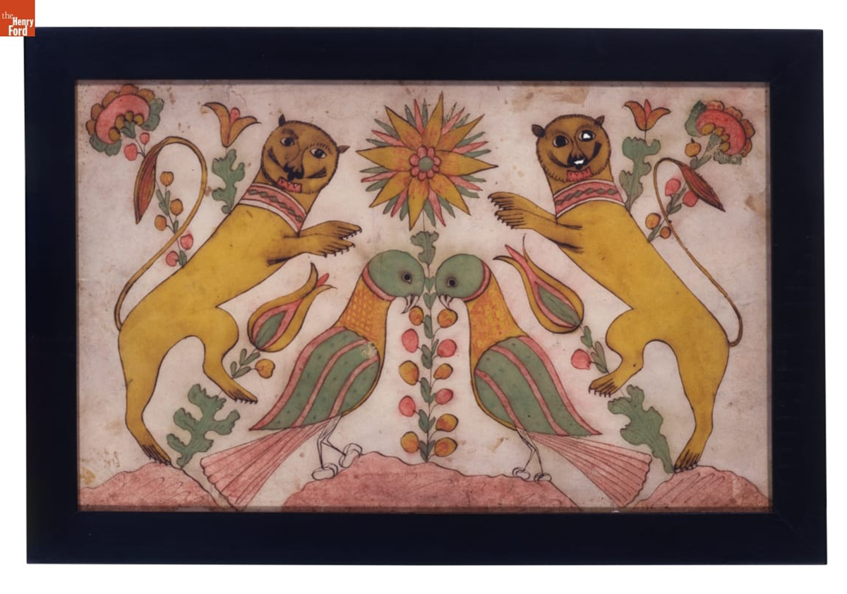
Confronted Lions and Birds, 1800-1820, made by Daniel Otto (active c. 1792-1822) Haines Township, Centre County, Pennsylvania, pen and ink and watercolor on woven paper, 00.3.3038 / THF119526
This Fraktur by Daniel Otto features a stylized central flower where everything on either side balances completely. This symmetry is the hallmark of folk art in general, and Pennsylvania German art in particular. Also note the whimsy or playfulness in the lions—they hardly look ferocious. This is yet another characteristic of Pennsylvania German art.
Decorative Motifs:
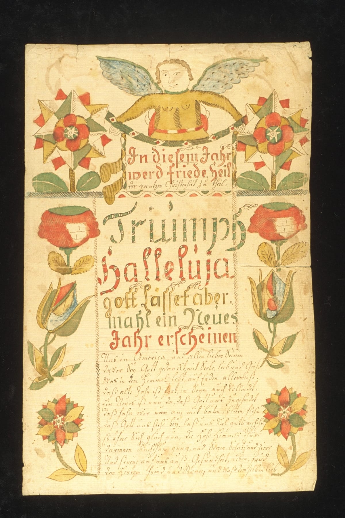
A New Year's Wish for Jacob Grimm and Family, circa 1775, made by Daniel Schumacher (active 1728–1787), worked in Berks, Lehigh, and Northampton Counties, 82.114.5 / THF305642
Notice that this piece, essentially an 18th-century New Year’s card, is symmetrically arranged around the text in the center. The highlight is the angel at the top. What is remarkable are the floral elements on either side. Tulips and stylized flowers are iconic design elements that appear in virtually every piece of Pennsylvania German art.
Another good example is this ceramic storage jar:
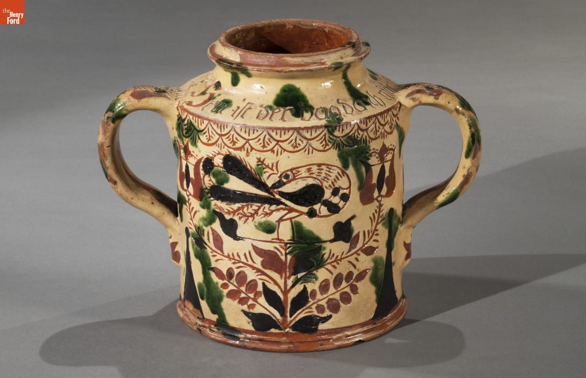
Storage jar, made between 1785-1796, made by George Hubener (1757-1828) Limerick Township, Montgomery County, Pennsylvania, 59.134.1 / THF177128
At the center of this jar, we find another peacock—which are in fact the 'confronted birds' in the second image above. Here, peacocks stand on the branches of a tree or bush. Notice that on either side, the floral branches terminate in tulip blossoms. Like peacocks or other stylized birds, the tulip is a motif frequently seen in Pennsylvania German folk art.
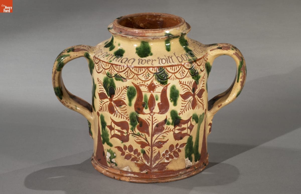
Reverse side of Storage jar, made between 1785-1796, made by George Hubener (1757-1828), Limerick Township, Montgomery County, Pennsylvania, 59.134.1 / THF177132
When we look at the reverse side of the jar, we see a variation of the image on the front. Of course, everything is arranged symmetrically, but instead of a bird at the center, we find a tulip blossom in its place. The space where the tulips were on the front side is now filled with abstracted floral elements.
The same use of symmetry is visible in this image of confronting peacocks:
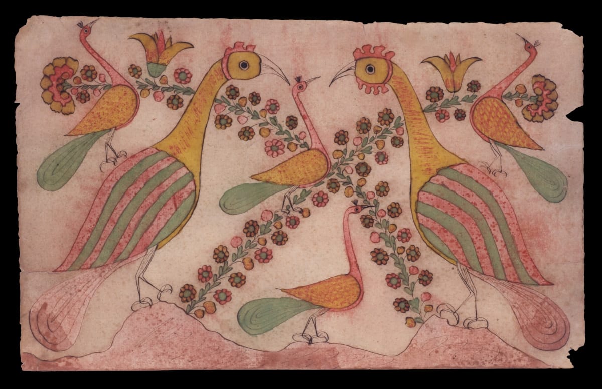
Confronted Peacocks, 1800-1820, made by Daniel Otto (active c. 1792-1822), Haines Township, Centre County, Pennsylvania, pen and ink and watercolor on wove paper, 29.2085.1 / THF119532
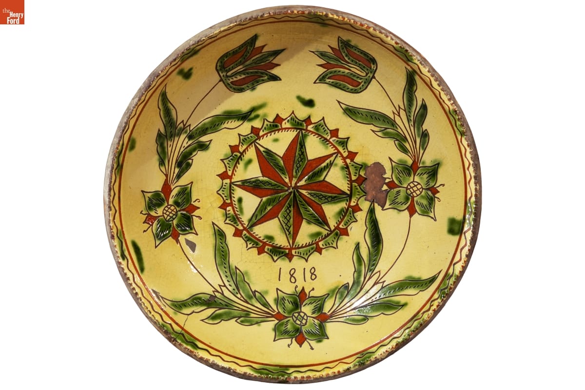
Plate, dated 1818, made by Andrew Headman, (active about 1756-1830), Rockhill Township, Bucks County, Pennsylvania, 56.54.1 / THF191114
This large plate, used primarily for decoration, is once again highly ornate, with a stylized star at the center. This is surrounded by a circle of triangles in red and green, which in turn is circled by a symmetrical row of ubiquitous tulips.
Furniture:
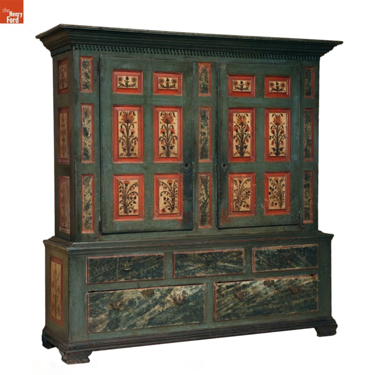
German American Wardrobe 1790-1800 59.80.1 / THF118499
Like all the examples we’ve seen, this wardrobe is decorated with flowers—some naturalistic, some stylized. It also uses reds against greens, like the plate above. Although called a wardrobe, or Schrank in German, it likely was used in a public room, like a parlor or dining room, where it was meant to impress guests. Of all the examples of Pennsylvania German folk art in the Museum’s collection, this is by far the largest and most impressive.
The Spreading Influence:
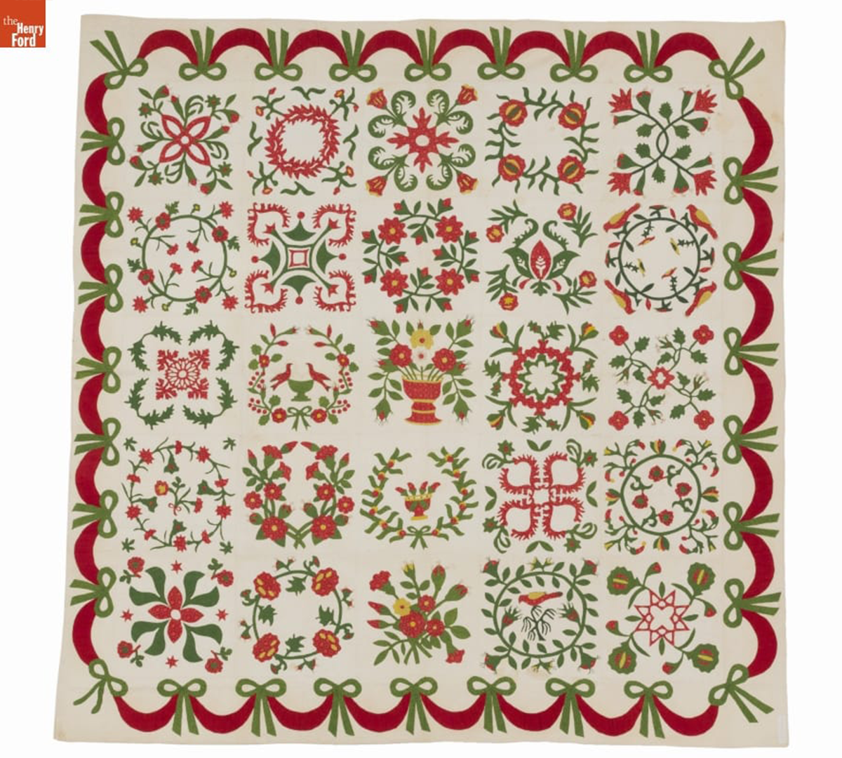
Album Quilt, probably made in southeastern Pennsylvania (perhaps in Chester County), circa 1850. One corner of this quilt carries an applied fabric strip with the inked inscription "Anne D. Morrison." 2016.22.1 / THF166494
By the middle of the 19th-century, the design vocabulary of the Pennsylvania Germans spread well beyond their community, encompassing the entire region. For example, we know that this “Album” quilt that utilizes the Pennsylvania German aesthetic was used by Anne Dawson Morrison (1798-1866), a prosperous Philadelphia Quaker.
These objects are just a small sampling of the large folk art collection of The Henry Ford. To see more, please go to https://www.thehenryford.org/collections-and-research/digital-collections/.
Charles Sable is Curator of Decorative Arts at The Henry Ford. Many thanks to Rachel Yerke-Osgood, Associate Curator at The Henry Ford, for editorial preparation assistance with this post.
"Everything I Do is Me" - Gwen Frostic
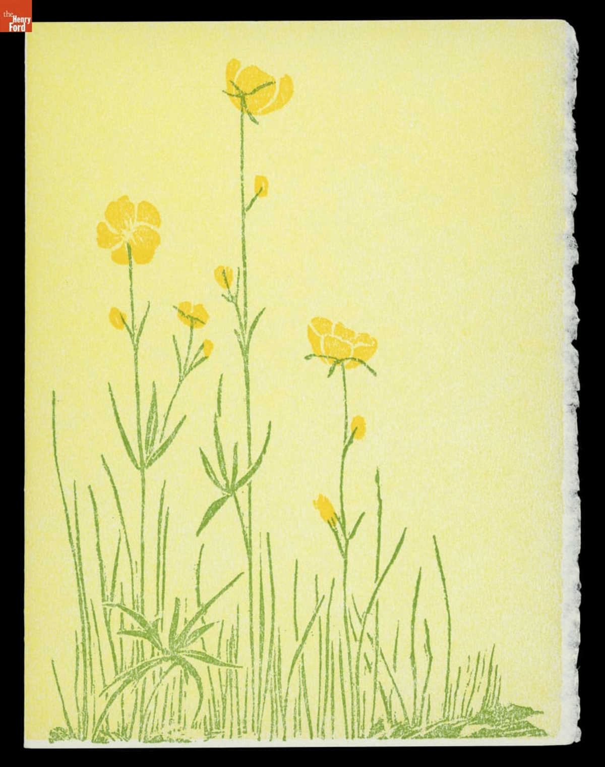
Greeting card created by famed Michigan artist Gwen Frostic, circa 1980 / THF719491
Born in 1906 in Sandusky, Michigan, Sara Gwendolen Frostic lived a many-faceted life. An unidentified illness contracted while still an infant—later assumed to be a mild case of polio, although it also may have been a fever that resulted in cerebral palsy—left Gwen with some physical differences; still, Gwen never considered herself disabled. After her family moved to Wyandotte in 1917, Gwen was exposed to both the sophisticated atmosphere of urban Detroit, and the lush botanical splendor of her family's garden. These two influences would be reflected throughout Gwen’s life, as she became both a successful businesswoman and a well-known advocate for nature.
Despite attending Michigan State Normal College and Western State Normal College (now Western Michigan University), Gwen left school without completing her degree, opting instead to create a metalworking business in her parents’ basement. Gwen’s talent soon drew attention: the Detroit YMCA asked her to teach metalworking classes, Clara Ford commissioned her to make two copper vases, and Monsanto requested that she create a piece for their 1939 World’s Fair display.
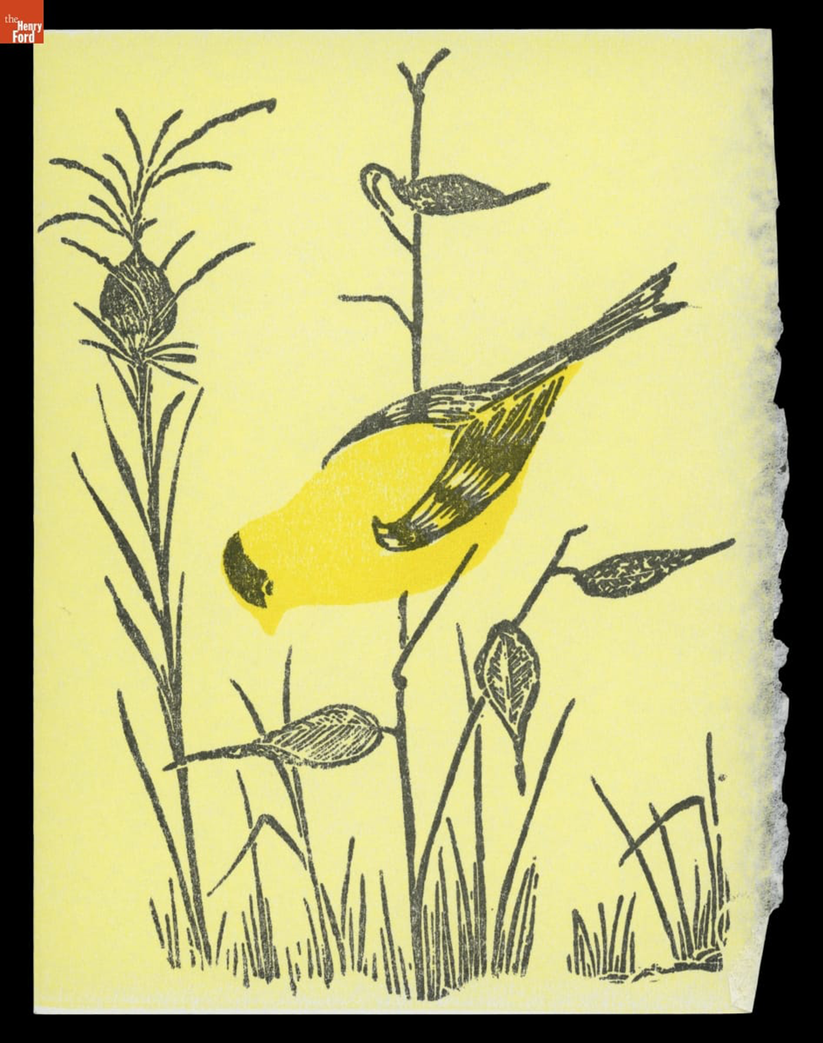
Greeting card created from linoleum block carved by Gwen Frostic / THF719495
When World War II redirected the supply of copper that Gwen had been using for her metalwork, she turned to linoleum block printing. Using a press that she disassembled and reassembled to learn how it worked, Gwen began printing commercial letterhead, stationery, and business cards; in between commercial jobs, she sketched her own nature designs and carved them into linoleum blocks. By the war’s end, Gwen was living in the back of her print shop—a set-up that she would continue in for the rest of her life. The business for which she would become most known— Presscraft Papers—had been born.
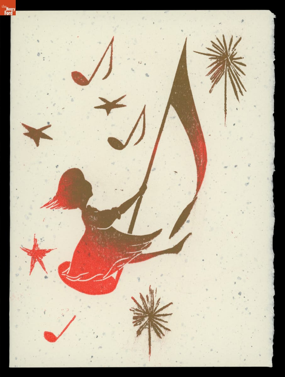
“Merry Christmas!,” 1955 / THF716787
After the death of her father in 1954, Gwen moved to Frankfort in northern Michigan, setting up a small shop downtown. In addition to selling her nature prints to the summer tourists who came to the scenic bayside town, Gwen developed a mail order trade that exponentially grew her business. In 1957, Gwen wrote her first book, My Michigan. Its style became one that she would use in all her subsequent publications: prose that is almost poetry, printed on thick, deckled paper, alongside charming natural elements printed from Gwen’s linoleum blocks.
For a woman who rarely wanted to talk about herself, her books are perhaps the closest revelation of who Gwen was: an intense thinker, enamored with the natural world around her, with an uncomplicated, pragmatic, yet optimistic view of the world.
On April 26, 1964, Gwen opened the new home of Presscraft Papers: a multi-level store built of trees, rocks, and a sod roof, set amidst a 40-acre swamp property along the Betsie River in Benzonia, Michigan. The main floor of the shop overlooked the print room, where visitors could see the Heidelberg presses that produced the stationery the store sold. On the second floor, carefully concealed from public view, was Gwen’s apartment, featuring two large screened-in porches and floor-to-ceiling windows overlooking the property’s pond.
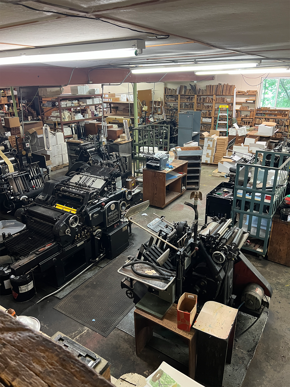
The Heidelberg presses (foreground) and handcarved linoleum blocks (back wall) used to print Gwen’s designs, 2024 / Photo courtesy of Rachel Yerke-Osgood
Despite being tucked in what many would consider to be the middle of nowhere, Gwen’s business thrived. By the 1980s, Presscraft Papers had made Gwen over a million dollars, as visitors flocked from across the state, across the country, and around the world. In addition to her business success, Gwen also received numerous awards and special recognitions. In 1978, May 23 was declared Gwen Frostic Day in Michigan. In 1986, she was inducted into the Michigan Women’s Hall of Fame. Rather than resting on her laurels, Gwen continued to create new designs and tend to her business well into her 90s.
In 2001—one day before her 95th birthday—Gwen passed away. Her shop remains, though, little changed from when Gwen herself lived and worked there. Much as the ducks still flock to the pond Gwen loved so much, visitors continue to flock to the store. While many come to shop, others come simply to drink in the tranquility of their surroundings and the charm of Gwen’s designs.
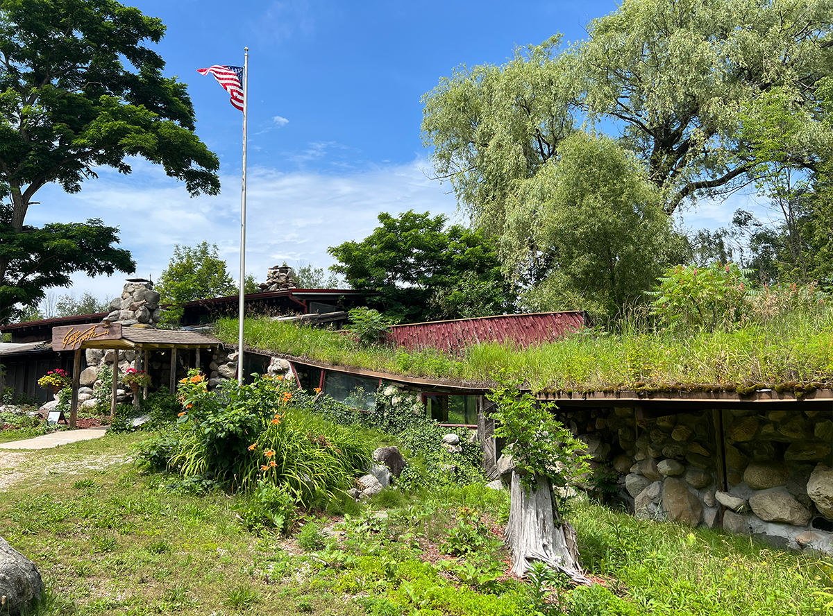
Gwen Frostic Prints, home of Presscraft Papers in Benzonia, Michigan / Photo courtesy of Rachel Yerke-Osgood
This, then, is the legacy that Gwen Frostic carved for herself as she carved her linoleum blocks: a gifted artist, a determined woman, and a devout lover of the natural world.
Rachel Yerke-Osgood is an associate curator at The Henry Ford.
Remembering Lillian Schwartz
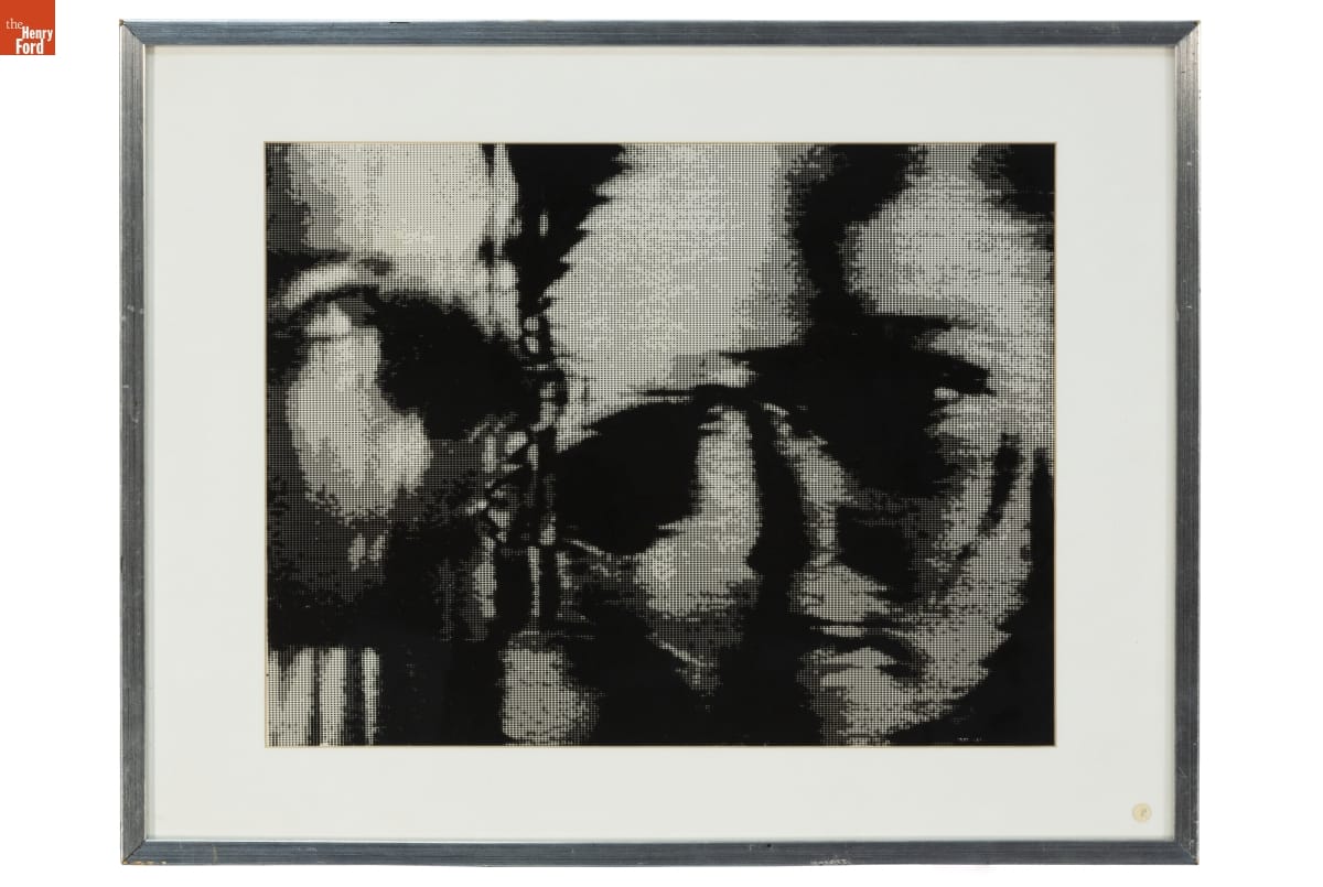
Self Portrait by Lillian F. Schwartz, circa 1979 / THF188557
On October 12, 2024, The Henry Ford was saddened to receive news of Lillian Schwartz's passing. Lillian was a visionary multimedia artist — an early adopter, innovator, and life-long learner in creative computing and digital art. At Bell Laboratories, she held the role of "resident visitor" from 1968-2002, where she created her celebrated films and videos. At the Labs, she described herself as a "morphodynamicist" and "pixellist." Max Mathews — director of Bell Labs' Acoustical and Behavioral Research Center — supported and advocated for Lillian, calling her "the brightest genius" he had ever met. Arno Penzias, a Nobel laureate for his co-discovery of the Big Bang Theory, credited her work as "establishing computers as a valid and fruitful artistic medium." There is no question that Lillian helped to define and expand the boundaries of digital creativity beginning in the late 1960s — a time when the very validity of computer-mediated art was in question.
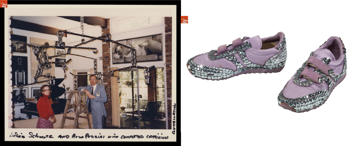
Left: Lillian Schwartz and Arno Penzias with the Capricious Constellation Sculpture, circa 1984 / THF705948
Right: Custom bedazzled Jordache sneakers made and worn by Lillian, circa 1984 / THF191767
In 2021, thanks to a generous donation by the Schwartz family, the Lillian F. Schwartz and Laurens R. Schwartz Collection found a permanent home at The Henry Ford. This collection contains thousands of objects documenting her life and art practice, spanning her childhood to late career. Lillian's expansive career is represented through her iconic films and videos, 2D artwork and sculptures, personal papers, computer hardware, and film editing equipment.
Since this acquisition, staff at The Henry Ford have been diligently conserving, restoring, organizing, digitizing, and interpreting this collection to improve accessibility and ensure ongoing recognition for Lillian's contributions. In 2023, I was honored to be deeply immersed in this collection while curating Lillian Schwartz: Whirlwind of Creativity. This retrospective exhibition provided a holistic portal to her life and artistic practice. Many of the exhibit's early "analog" and 2D works showed a clear lineage to the aesthetic values seen in her film and digital art that would follow.
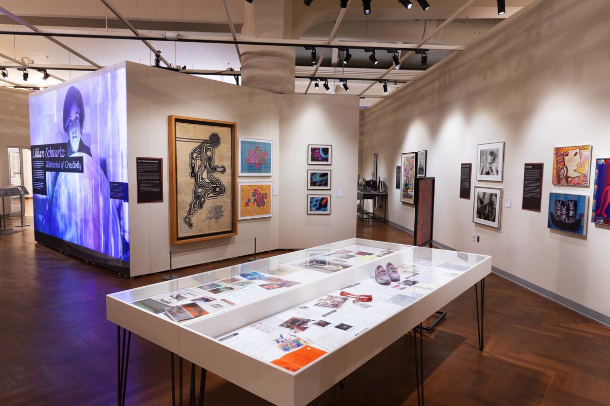
Exhibition view of Lillian Schwartz: Whirlwind of Creativity, which was open at The Henry Ford from March 2023-March 2024. Image by Staff of The Henry Ford.
Since acquiring this collection, The Henry Ford has collaborated with major museums, institutions, and educators by providing loans of her work for exhibitions, film festivals, and public programs — ensuring the continuation of her presence and legacy at a global scale. Notably, The Henry Ford has provided loans to international venues including: Venice Biennale, LACMA, ZKM Centre for Art & Media, Mudam Luxembourg, Tate Modern, Buffalo AKG, the Computer History Museum, and many more.
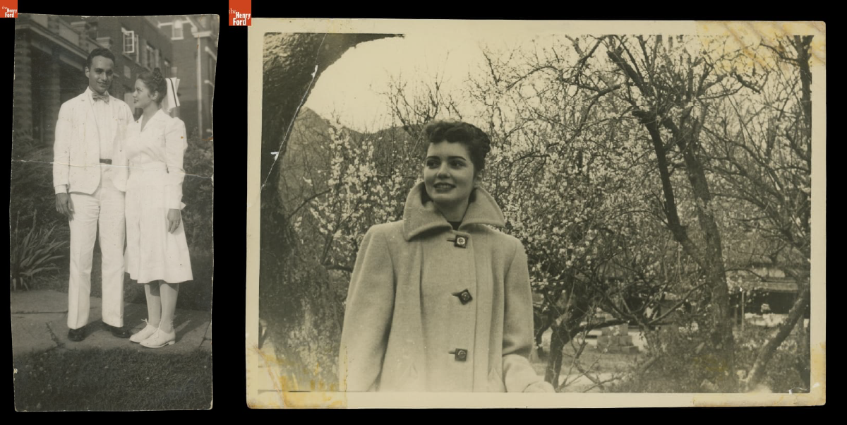
Left: Lillian and Jack J. Schwartz, circa 1946 / THF704695
Right: Lillian Schwartz with a Flowering Plum Tree in Japan, 1948-1950 / THF705897
Lillian was born in Cincinnati in 1927 to Russian and English immigrant parents. Her large family faced economic challenges and, as Jewish people, became the targets of antisemitism. In 1944, Lillian applied to join the U.S. Cadet Nurse Corps — a program designed to address the WWII nursing shortage. Lillian struggled with nursing people but enjoyed mixing medicines, painting murals in the children's ward, and making sculptures from plaster supplies intended for broken bones. Here, Lillian realized she was an artist, not a nurse. During this time, she met her future husband, Jack Schwartz, a doctor in training. They were married in 1946. In 1949, Lillian and her newborn son Jeffrey traveled across the Pacific Ocean by U.S. Army transport ship to be reunited with Jack, who was stationed at a hospital in Fukuoka, Japan. Just weeks after this journey, Lillian contracted polio and was quarantined; she worked diligently for months to overcome the worst of her paralysis, but upon her return, she continued to face health issues, which she referenced in her work.
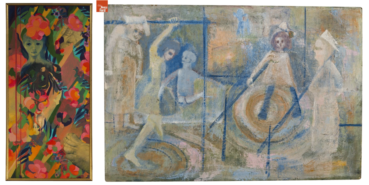
Many of Lillian's earliest paintings have childhood, motherhood, and family themes. Other times, they reflect traumatic events that Lillian faced. Left: Lady with Foot,' 1962 / THF190937
Right: After Polio,' circa 1950 / THF193129
In October 1968, Lillian received news that her kinetic sculpture — Proxima Centauri — had been selected by curator Pontus Hultén for an exhibition at the Museum of Modern Art in New York City, "The Machine as Seen at the End of the Mechanical Age." It was a breakthrough moment in her career.
Lillian met the scientist Leon Harmon at the MoMA opening, and he invited her to visit his workplace, Bell Laboratories. This fateful meeting led to Lillian's introduction to the people, equipment, and software integral in creating her first computer films. In her unpublished memoir, Lillian recalls: "When I first saw Leon Harmon at the opening reception of the 'Machine' exhibition, he was on his hands and knees peeking under the pad that covered the mechanism that triggered my sculpture to move up and down. When he looked up, he saw me standing in front of his computer-generated nude [Studies in Perception I (Computer Nude)]."
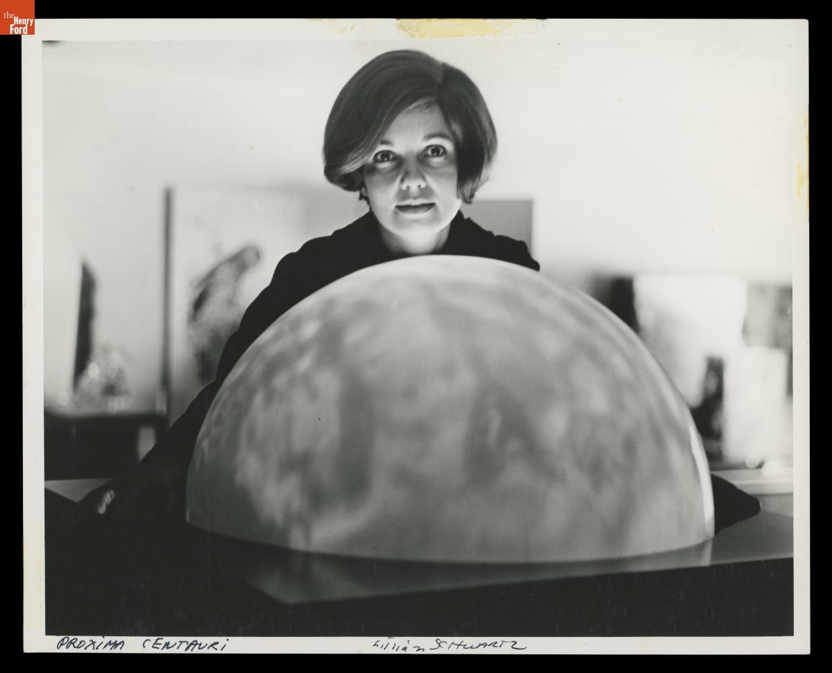
Lillian Schwartz with ‘Proxima Centauri’ Globe, 1968-69. The globe that Lillian used was originally designed to be a municipal streetlamp cover. / THF705911
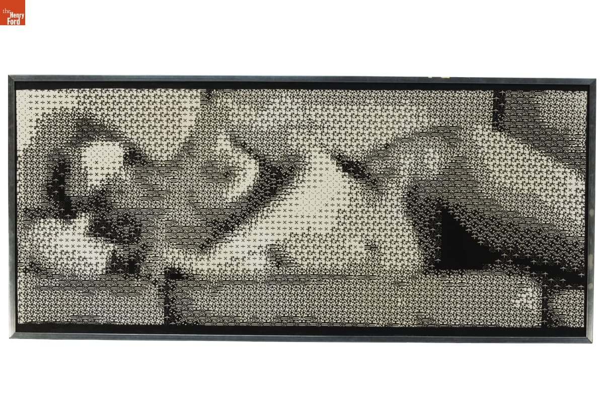
Studies in Perception I (Computer Nude) by Leon D. Harmon and Kenneth C. Knowlton is considered to be the first ‘digital nude.’ It was shown in the same MoMA exhibit as Proxima Centauri / THF188553
Lillian's youngest son and frequent collaborator Laurens remembers how he and Lillian "explored trash in the Bowery, bringing back wire, motors, and a globe that had been a streetlamp cover. But Lillian also created new tools and media. In 1960, she convinced the owner of a plastics factory to let her use it at night, moving rods to shape abstract [sculptures]. She built kinetics using metal frames lit inside to highlight the colors and movement of liquids through tubing and receptacles she bought from a medical supplier."
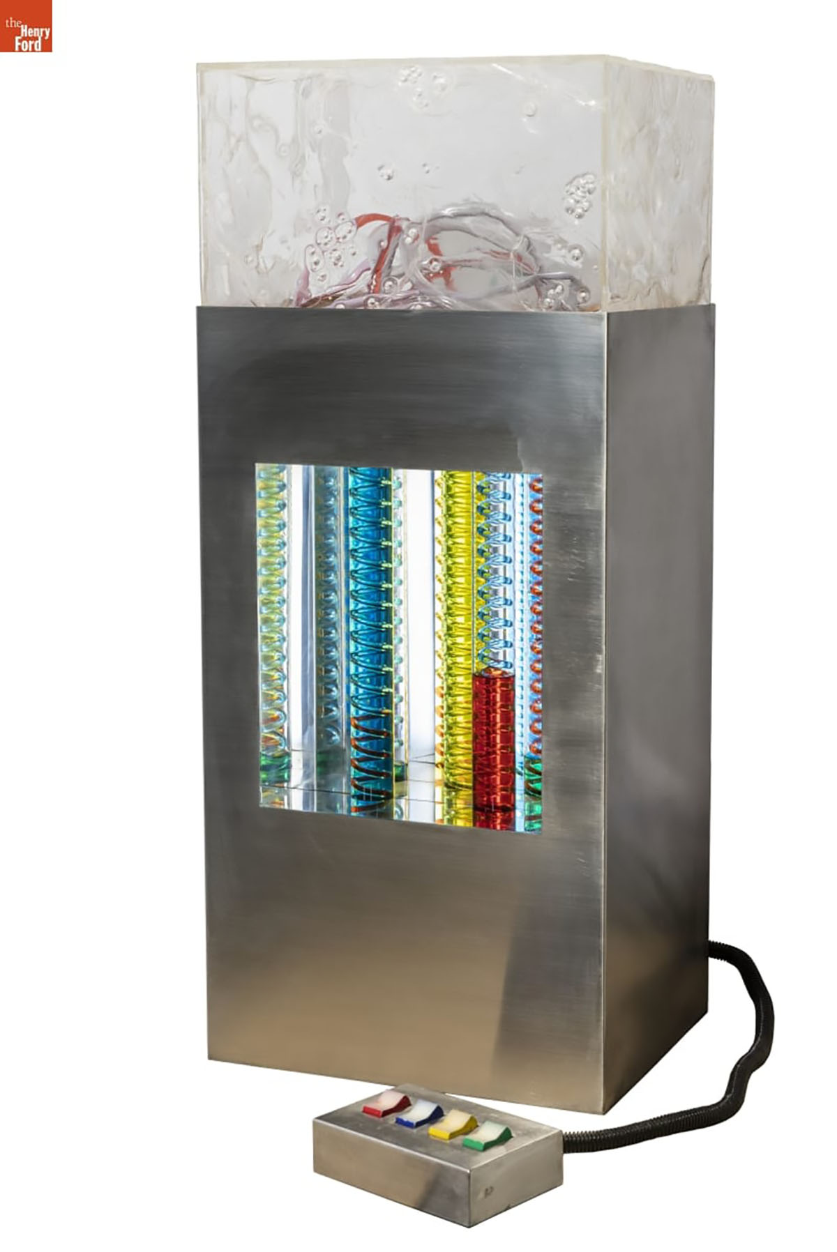
To prepare for the exhibit, our conservation team restored several kinetic sculptures that had not been exhibited in decades, including Proxima Centauri and World’s Fair, shown here. / THF370299
The kinetic sculpture referenced in this memory is World's Fair — a mock-up that Lillian created to propose a 70-foot-tall water sculpture for Expo 70 in Osaka, Japan. The sculpture was never built at full scale. The spiraling glass tubes in this version were given to her by a chemist planning to throw them in the trash. Lillian imagined how they could be filled with color and light to create the illusion of multiple colors. In her unpublished memoir, she described the process of finding the pigments to meet her vision: "Since I could not find the right green I wanted, I emptied [my husband Jack's] Creme de Menthe from the liquor cabinet. Of course, Jack was not happy. Even worse, I took all the red cough syrup samples from Jack's [medical] office. Not as expensive, but not the right thing to do."
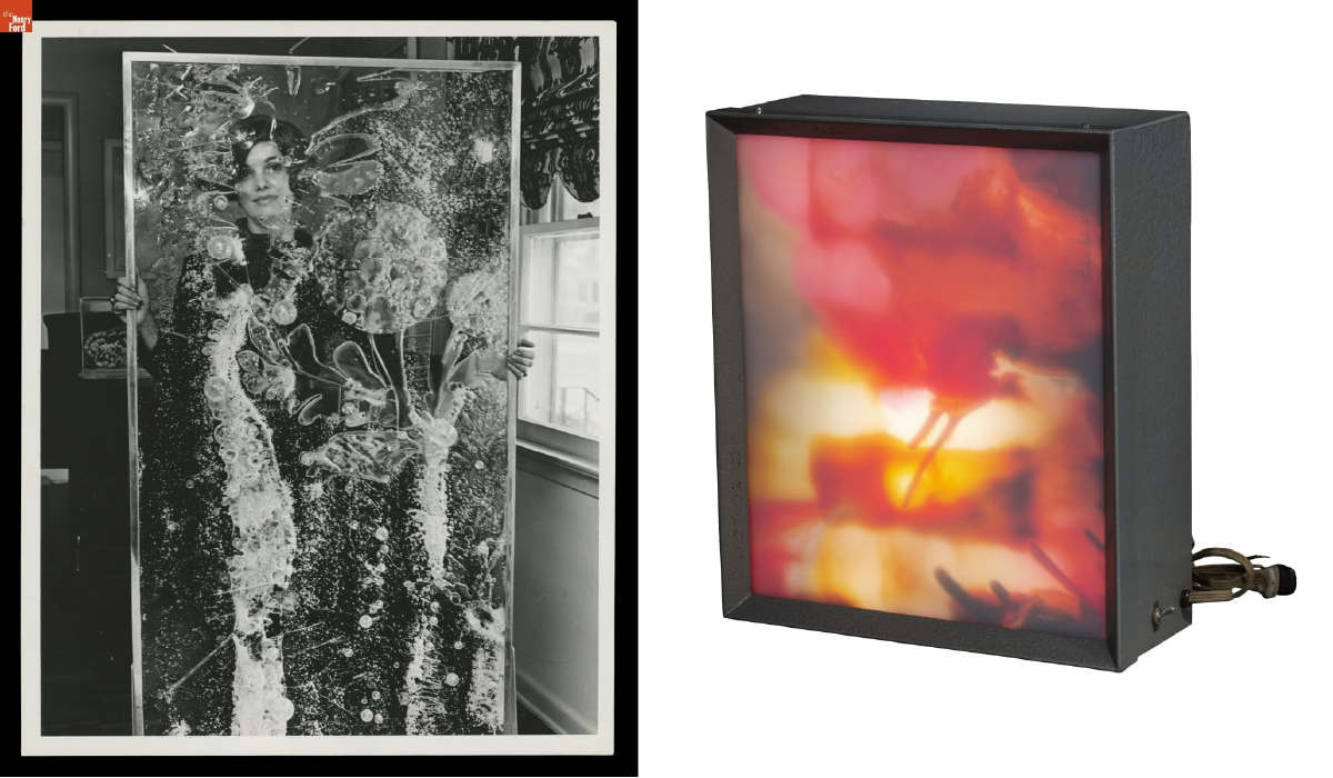
Left: Lillian Schwartz looking through one of her acrylic panels, 1968 / THF706047
Right: Illuminated Light Box by Lillian F. Schwartz, 1966 / THF188459
Lillian also created large cast acrylic resin sculptures. Once the resin hardened, she used a blowtorch to melt and change the plastic, sometimes gluing on extra material or using pigment to add color. She brought many of her sculptures and paintings to life by introducing sound, light, and electronic sensors. She called these works "electric paintings." Even her non-digital and kinetic works — screenprints hung on a wall or sculptures sitting static on a pedestal — clearly show Lillian's desire to create motion, eventually leading to the trailblazing computer films she would make at Bell Laboratories.
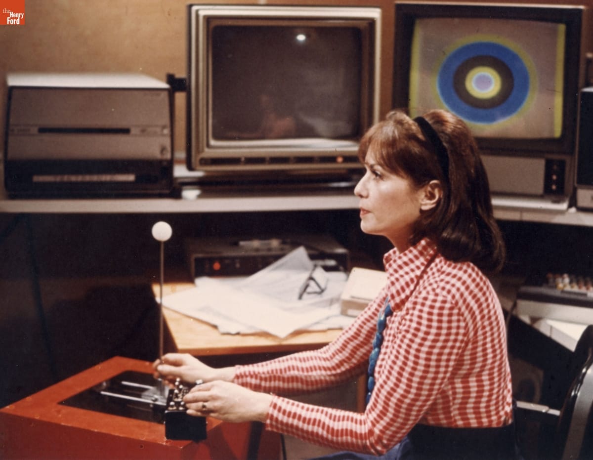
Lillian Schwartz photographed at work at Bell Laboratories by Gerard Holzmann, circa 1975 / THF149836
By gaining an invitation to Bell Labs, Lillian was in a rare and privileged position at one of the world's most revered research facilities. On her first day, she was introduced to the large mainframe computers and bespoke software that would lead to her first 2D digital artworks and computer-mediated films. On lunch breaks in the cafeteria, she formed fruitful collaborations with scientists. As she wandered the halls on breaks, she peered through open doors and was invited in for demonstrations of cutting-edge technology. With permission, she scavenged toss-off material from the trash to use in her own work. At night, she attended math, logic, and computer programming courses at the New School.
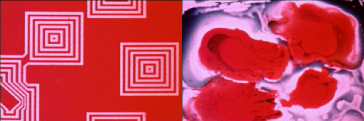
Digital born (left) and hand painted (right) stills from Pixillation, 1970 / THF701620 & THF701618
In 1969, Lillian received a $250 grant from AT&T Bell Laboratories to begin creating her first film, Pixillation. Given the limitations of 1960s computers, the process was time-consuming and frustrating. After several weeks of work, she had mere seconds of footage, so found creative ways to meet her deadline. She smeared and dropped paint onto glass to create abstract patterns, drawing her finger through the pigment to mimic the pixelated squares generated by the computer. She used a microscope to photograph growing crystals. She reshot the computer footage on an optical bench, adding color and motion. A soundtrack by Gershon Kingsley was added, which was crucial in and of itself for being composed on a new electronic instrument — the Moog synthesizer. By 1970, Pixillation was finally complete. Today, this film continues to be hailed as a masterwork of experimental film with its hypnotic and chaotic blend of computer-born and hand-painted imagery. Many awards and many films followed, a selection of which are visible in our Digital Collections.
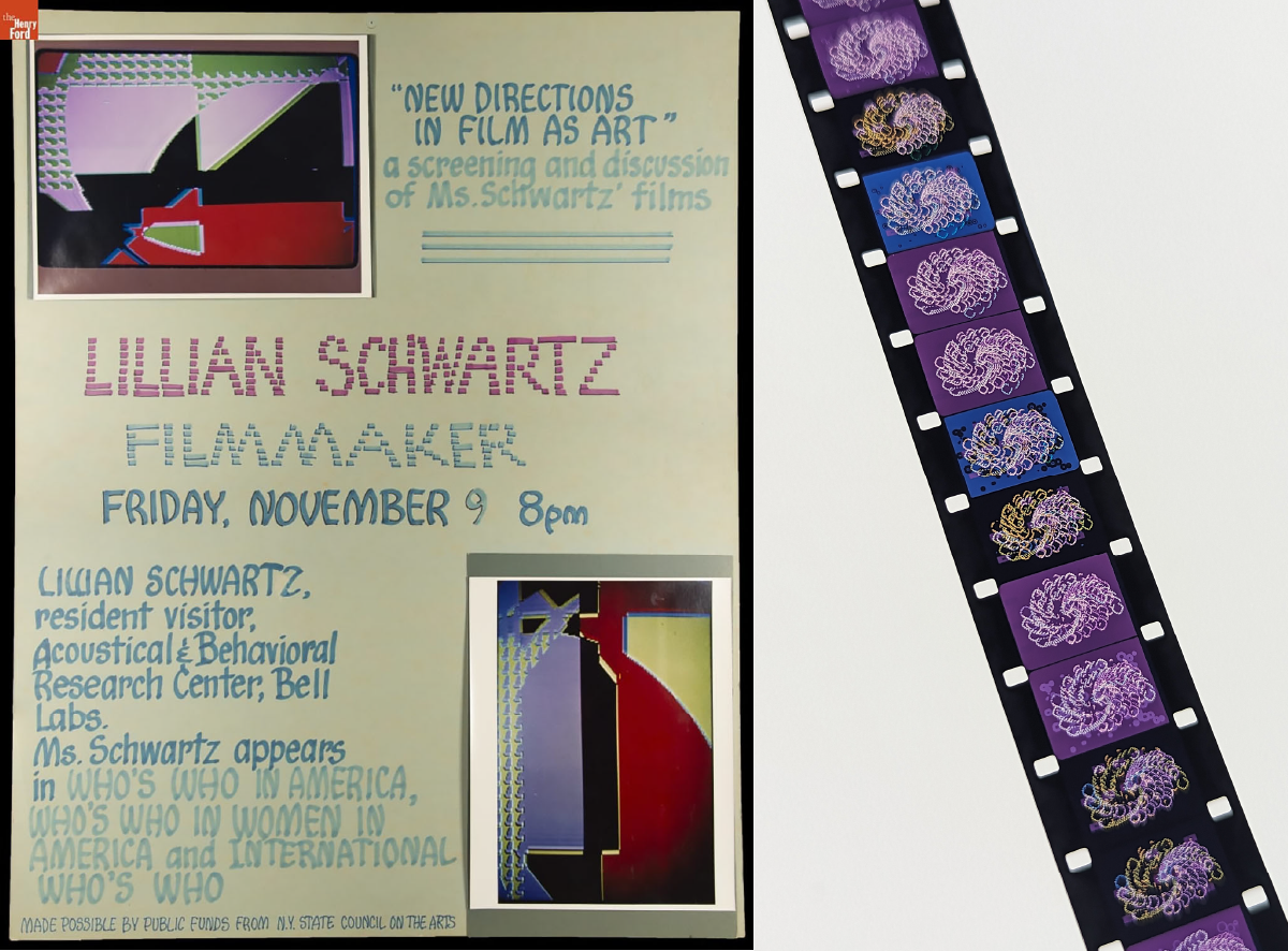
Left: Advertisement for a screening of Lillian’s work / THF628917
Right: A view of one of Lillian’s films, currently undergoing restoration. Photo by Kristen Gallerneaux.
Lillian saw computers as exciting tools full of possibility, but her peers also described her as having a healthy sense of "technological ingratitude." In her most playful and impatient moments, she sought out the limitations of technology — embracing its glitches, feedback, and happy mistakes. She described this impulse: "…the machine had to keep pace with me — just as I learned that I had to grow with the machine as its scientifically oriented powers evolved."
In her 2013 oral history with the Computer History Museum, she shared a potent memory that foreshadowed her later life as a filmmaker: "My story was as long as the pavement in front of my house. [...] When I had drawn as far as I could, I ran back to my house, sat on a step and looked at the pictures in my head to see the rest of the story." Lillian will be missed immensely, and we at The Henry Ford are honored to be stewards of her legacy.
Kristen Gallerneaux is the Curator of Communications & Information Technology at The Henry Ford.
Further Resources:
Office Staple
Designed decades ago, the Aeron Chair remains a wonder of ergonomics.
Even while seated, people tend to crave motion. Chairs that move — by rocking, reclining, rolling, revolving or otherwise — are often the most comfortable chairs because they respond to the body. This principle was one of many incorporated into the study of ergonomics, or the science of designing products and environments for compatibility with the human body.
In the 1960s, ergonomics began to gain traction with industrial designers. Bill Stumpf came of age as a designer during this period and became interested in ergonomics in the late 1960s while a postgraduate at the University of Wisconsin. He studied existing ergonomics research by designers as well as the work of scientists, doctors and medical researchers. Stumpf applied these scientific principles in the design of his first office chair for the Herman Miller furniture company. Called the Ergon Chair (short for ergonomic), it debuted in 1976 as the first truly ergonomic office chair.
Perhaps the best-known ergonomic office chair, the Aeron Chair, was also designed by Stumpf in partnership with Don Chadwick. Office workers spend hours seated at a desk, mainly since the rise of personal computers, and office chairs before the 1970s often did more harm than good to their inhabitants. Stumpf and Chadwick endeavored to design an ergonomic office chair that built on the lessons they learned in developing their previous chairs, especially their Sarah Chair, which was designed for the elderly to mitigate the bodily impact of sitting for long periods.

Photo by EE Berger
The Aeron Chair was released in 1994 to immediate acclaim. The seat of the chair uses an elastic plastic mesh, called pellicle, to replace the foam cushions of a traditional office chair. A tilt mechanism, with adjustable components, provides opportunities for movement, even at rest.
Although the Aeron Chair turned 30 years old this year, it is still regarded as the gold standard in office chairs — its ergonomic design continuing to serve the needs of office workers around the world.
This post was written by Katherine White, curator of design at The Henry Ford, and adapted from an article in the Winter/Spring 2024 issue of The Henry Ford Magazine.
When Art and Activism Merge
“The artist's role is that of the soldier of the revolution.” -Diego Rivera
How does one interpret art? How does one view activism or protest? These concepts have merged for centuries to convey a message and drive change. “Activist Art,” as defined by the Tate Museum in London, is “a term used to describe art grounded in the act of ‘doing’ and addresses political or social issues.” It is a tool for change, a powerful medium that also challenges and disrupts them, stimulating thought and pushing boundaries. It is innovative, boundary-pushing, and, above all, a force for progress, empowering us with the hope that change is possible.
Throughout history, we can trace the influence of art on activism and protest. Both concepts have been intertwined since the birth of the United States. Consider the Boston Tea Party in 1773. This iconic and performative event was an act of protest aimed at making a point, immediately sparking illustrations in local newspapers. Colonists used images like this to advance their cause of independence and freedom, creating a rich historical tapestry that we can still learn from today, connecting us to our past and its influence on the present.
Even earlier, the revolutionary cause and the Boston massacre provide powerful examples of art's influence. This event, depicted in newspapers across the colonies, played a crucial role in fueling the desire for independence—leading to the Boston Tea Party, other smaller rebellions, and eventually to the American Revolution. This is a compelling example of how images can play a pivotal role in shifting a narrative and shaping history, enlightening us about the power of art in social and political change.
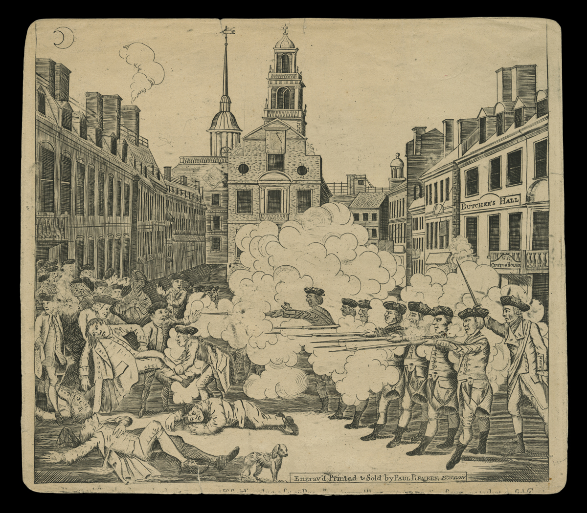
The Bloody Massacre Perpetrated in King Street, Boston, on March 5, 1770, from the collections of the Henry Ford / THF130817
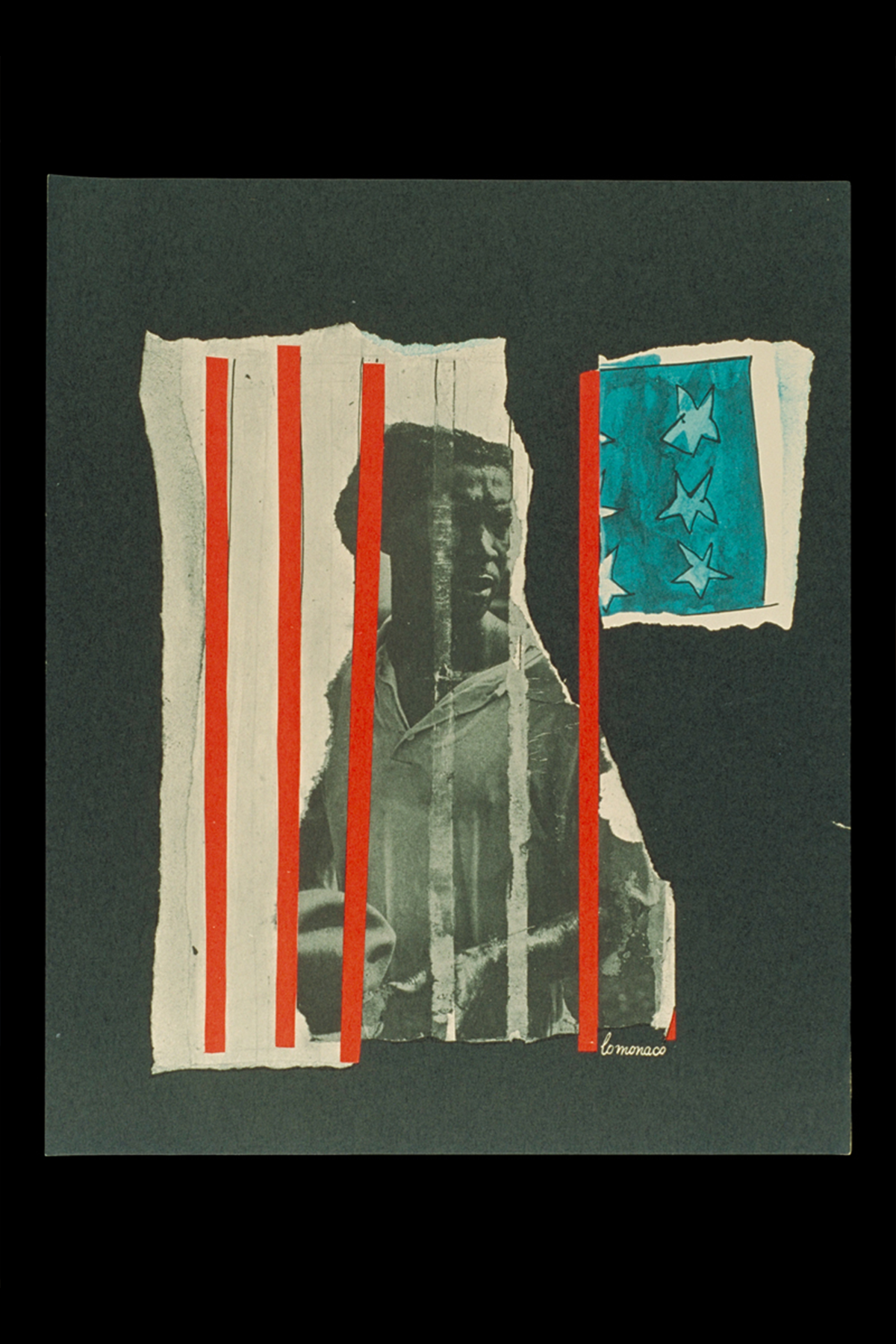
A jail can only hold a man’s body - his mind and heart remain free, by Lo Monaco’s “We Shall Overcome” 1963 print portfolio, from the collections of The Henry Ford / THF93154
On August 28, 1963, the March for Freedom and Jobs took place in Washington, D.C. The print above comes from a portfolio containing five images created by the graphic artist, Lo Monaco. The portfolio was created to hold memories of the march that day, serving as a message and reminder of the work needed to address issues of bigotry and racism in the United States.
Diné artist Demian DinéYazhi’ made the print below, my ancestors will not let me forget this, as a statement about the original 13 colonies and how life changed drastically for the Indigenous people after the American Revolution. They created it in the summer of 2020 after the murder of George Floyd, when there was much racial tension in the United States and questions related to equality and human rights. This print was inspired by an earlier piece DinéYazhi’ created for the Eiteljorg Museum in 2019. As the artist is Indigenous, this piece speaks to colonization and the broader context; it addresses how we think about the United States and, in this case, what the flag means to Indigenous people.. It is proactive, bold, activism, and art, inspiring us to continue the fight for equality and human rights.

my ancestors will not let me forget this by Demian DinéYazhi’ (Diné), from the collections of The Henry Ford / THF718200
Collecting in the moment—known as rapid response collecting--allows curators to gather significant items in the moment, as historic and social events are happening. The Henry Ford actively engages in this type of collecting, as do other large cultural institutions. Some of this rapid response collecting happened during the 2020 Black Lives Matter protests, the COVID-19 pandemic, and presidential election seasons. Rapid collecting can be difficult—it can be messy, and it happens fast. However, as we are a cultural institution, it benefits our collections to gather important historical moments as they happen.
On February 14, 2018, Marjory Stoneman Douglas High School became the site of a mass school shooting.Since the school is located in Parkland, Florida, the incident is often referred to as the Parkland shooting. Seventeen students and staff lost their lives that day. Since the shooting at Columbine High School in 1999, the number of school shootings in the United States has steadily increased. After the Parkland shooting, the students united and organized and created March for Our Lives. On March 24, 2018, just a short five weeks after the shooting, March for Our Lives held the largest student-led protest in US history in Washington, DC, with 1.2 to 2 million people in attendance and more participating around the world. Partnering with the Amplifier Art Foundation, artist Micah Bazant created this poster, carried at the marches by protesters.

Protect Kids Not Guns by Micah Bazant, from the collections of the Henry Ford / 2018.88.5
Activism and art each make us think. Combining them creates change and can even start revolutions. In addition to the quote that started this post, Diego Rivera also said: "Great protests are great works of art.” Art as protest, and protest as art—the two concepts will hold hands forever.
Heather Bruegl (Oneida/Stockbridge-Munsee) is the curator of political and civic engagement at The Henry Ford.
Playing in Band: Ford Motor Company Employee Bands
Travel, radio fame, snazzy uniforms, and safety rallies. All of this and more were part of life for employee bands at Ford Motor Company.
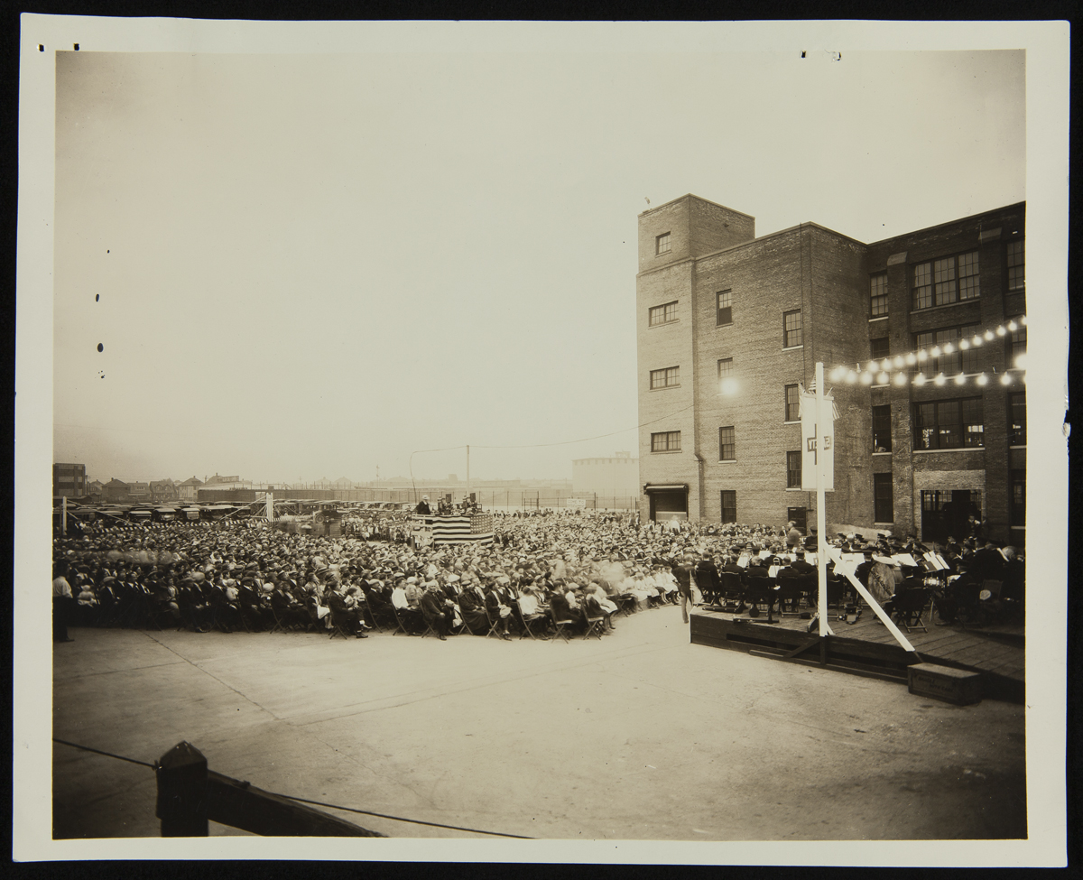
Worker Safety Rally at Lincoln Motor Company Plant, Detroit, Michigan, 1924. / THF261634
The company sponsored a number of employee bands, often hiring musicians into very flexible jobs so they could devote as much time as possible to their music. They played at company events; fairs; on Ford’s radio station, WWI; at competitions; and even traveled on tour. Each band had its own style of music, uniforms, and repertoire. Let’s take a look at some of the bands we have information on in the Ford Motor Company papers which are now part of The Henry Ford’s Benson Ford Research Center archives.
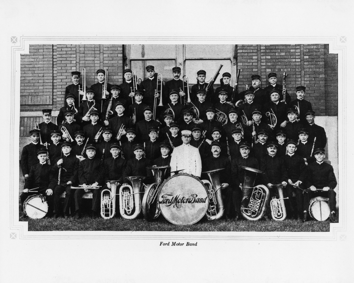
Ford Motor Band. / THF67917
The Ford Band was a marching band formed in the 1910s. They gave their first concert in 1912 at the Administration Building to an audience of 348 and it was all riches and fame from there — well maybe just fame. Led by Harry Philip, the all-employee band averaged between 40-50 musicians. In 1916, they accompanied the East Michigan Pikers on a five-day tour from Detroit to Mackinac Island to promote good roads, travelling in 10 Ford touring cars and playing 21 times a day. They played many company events, gave regular concerts for Ford employees and the public at the Arcadia Auditorium, were a staple at Ford safety rallies, and were often showcased on Ford’s WWI radio station.
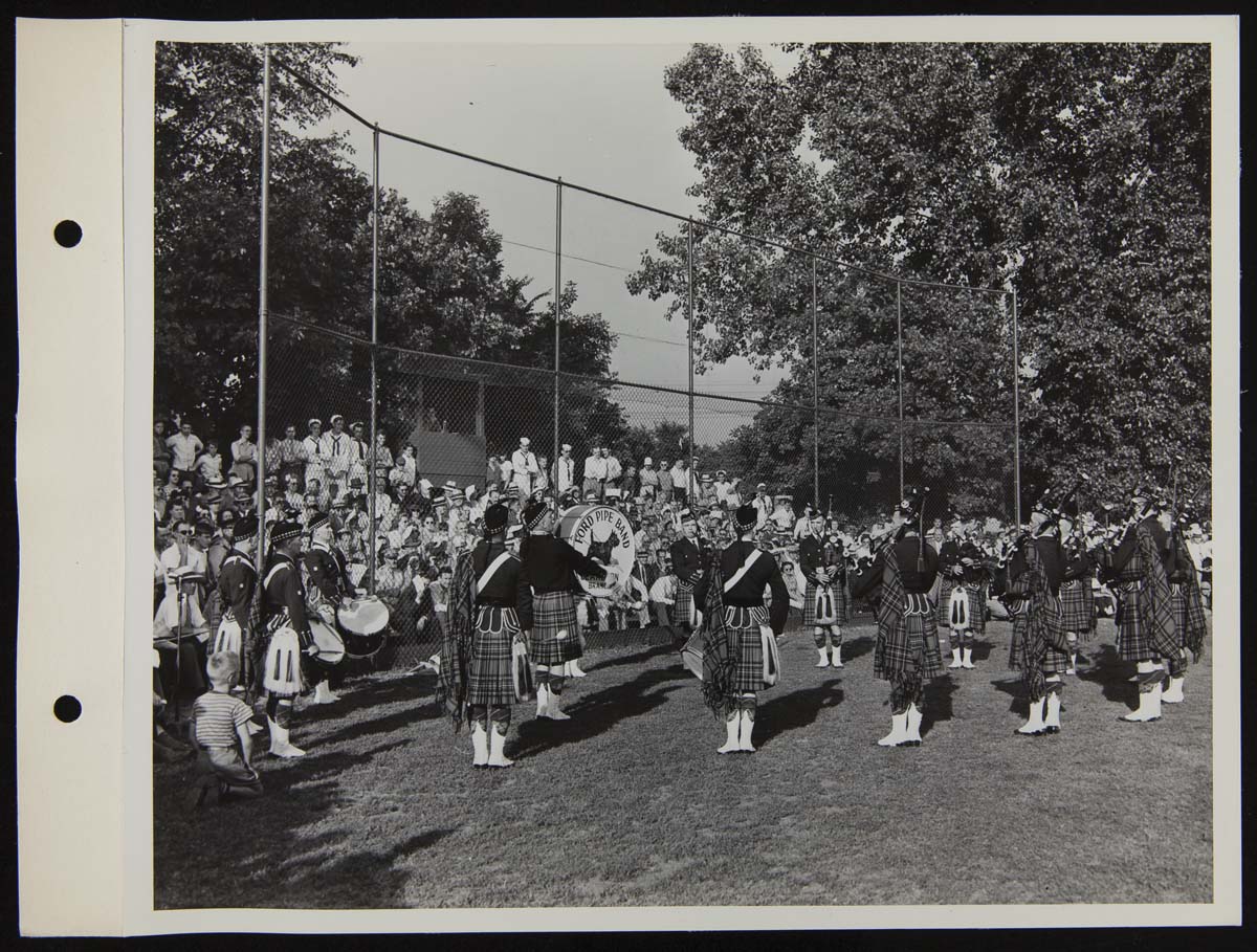
Ford Pipe Band at Ford All-Stars vs. Great Lakes Navy Baseball Game, July 1944 / THF272062
The Ford Pipe Band was formed in 1932 when Alexander Adams, the drum major (who was Edsel Ford’s bodyguard), began recruiting musicians to come work at Ford. The Pipe Major, Hector McInnes, bass drummer, William Riddock, and pipers, James Cullen and Donald McPhee, all worked in Plant Protection, with many of the other members working in departments across the company. Ford sponsored the band and paid for all transportation and lodging, but the band had to pay for their own uniforms. Alec Bryce, one of the drummers, recalled that the band specially ordered their uniforms from Scotland and had them shipped to Ontario, smuggling the uniforms into the U.S. piece by piece to avoid the extra customs fees. The band played at Ford Merit Club meetings, local parades, Scottish games, and other Ford and Lincoln-Mercury events and won both the American and All-Canadian piping championships in 1939.
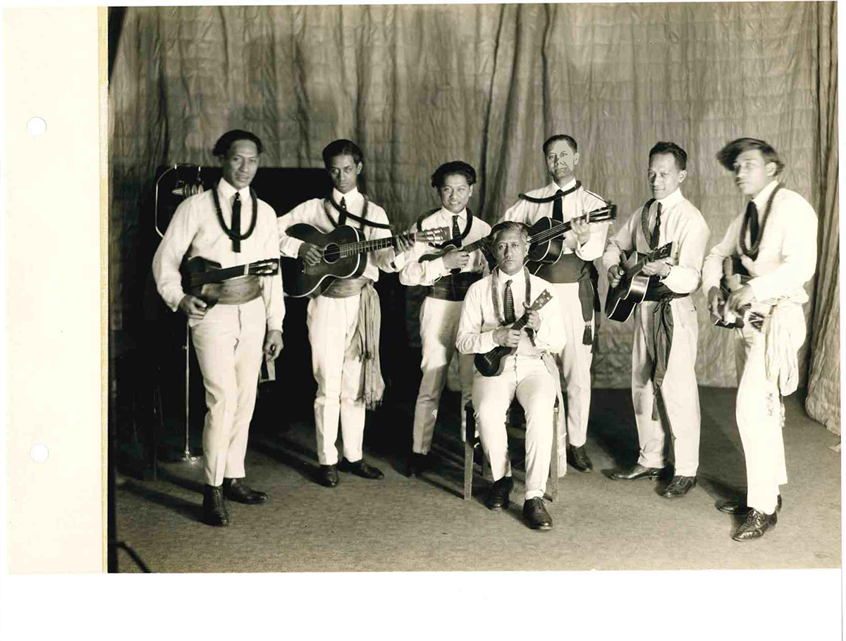
Ford Hawaiians, 1923. Acc.1660 box 146. / Image by Kathy Makas
The Ford Hawaiian Quintet (also known as the Ford Hawaiians) was a ukelele band led by Henry Kailimai. After hearing the band at the 1915 Panama–Pacific International Exposition in San Franscico, Henry Ford signed them up to travel to Detroit for a series of concerts and then a tour of the East Coast.
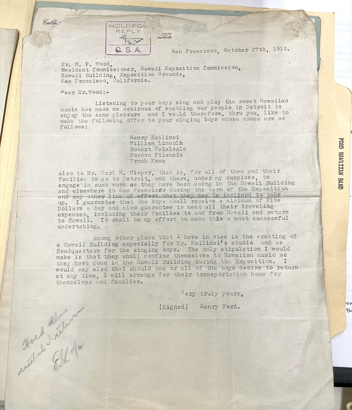
Ford Hawaiian Band. Acc. 62 box 12 / Image by Kathy Makas
Kailimai and the band returned to Detroit with their families, completing a two-year course at the Ford Service School before going to work for the company. After a hiatus in 1917-1918 when several members served in WWI, they continued into the 1920s, even becoming recording artists for one of Thomas Edison’s phonograph companies. The band was up for hire all over the Detroit area playing at concert halls, country clubs, lodges, churches and private events – they even gave ukelele lessons. Some of their hits included “Aloha Oe,” “Moani Ke Ala,” “Lei Poni Moi,” and “Ko Maka Palupalu.” You can hear some of these recordings at the UCSB Cylinder Audio Archive.
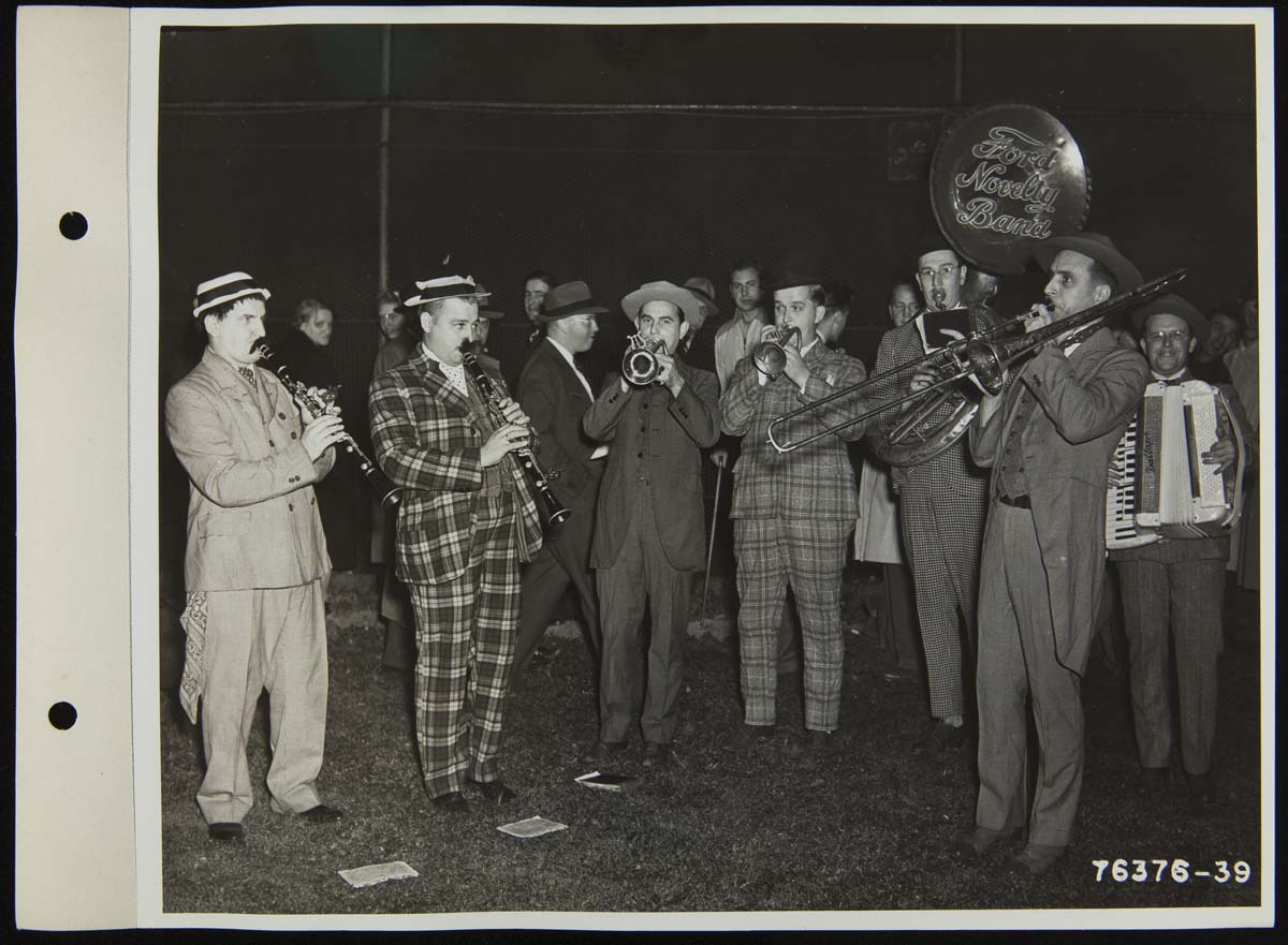
Ford Novelty Band Playing at Ford Baseball Team Game, 1941 / THF271722
The Ford Novelty Band added a comic touch to Ford events, playing at company ball games throughout the 1940s. They played at every game of the 1947 Ford softball playoffs at Levagood Park in Dearborn adding to the value of the $0.25 ticket price fans paid for each game.
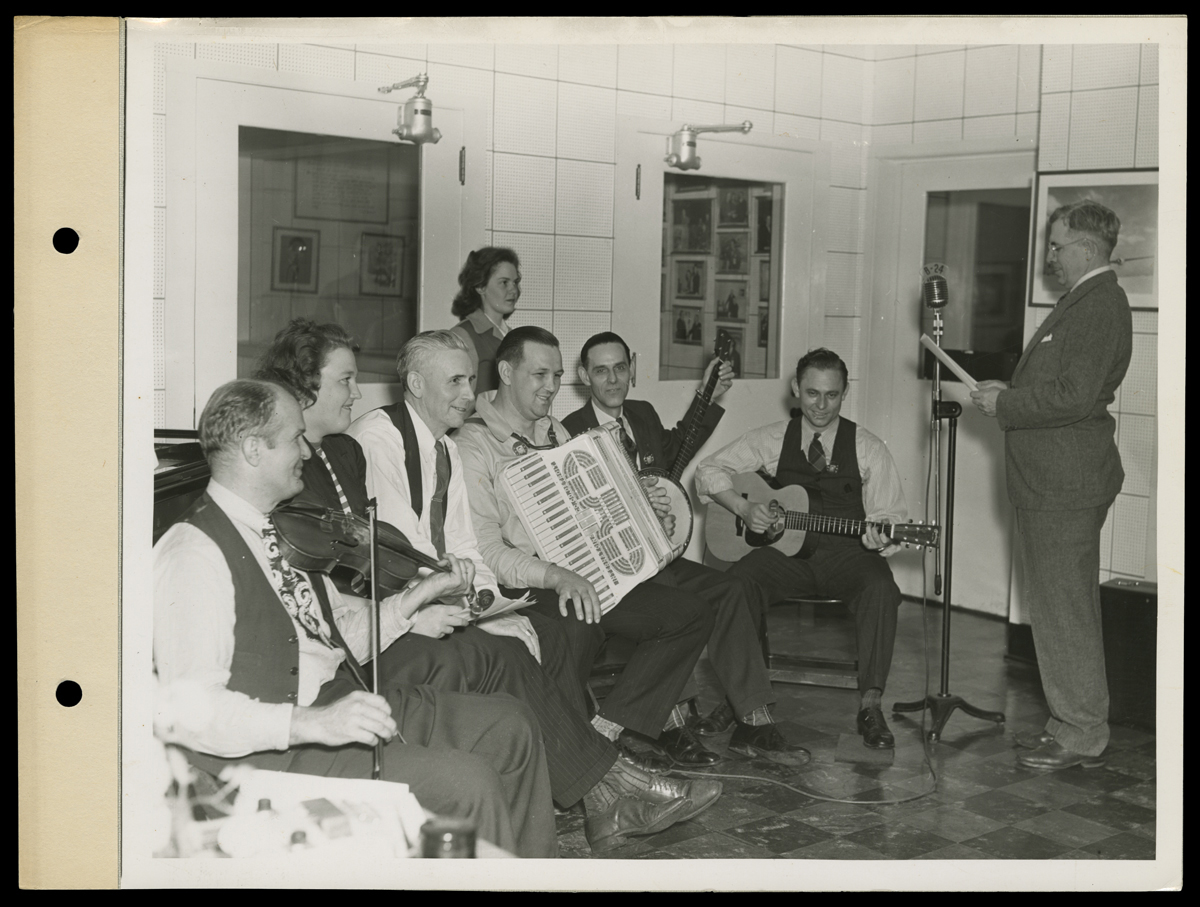
Old Timer's Band at B-24 Radio Station Broadcast Studio, Willow Run Bomber Plant, 1944 / THF93762
In addition to the bands we’ve looked at, there were many other employee bands at Ford, including: Ford Trade School German Band, Ford Ramblers, Ford Rube Band, Ford String Ensemble, Ford Glass House Quintet, Ford Motor Company Clarinet Quartet, and Ford Motor Company Saxophone Band. There were also company sponsored bands that weren’t made up of employees like the Ford Orchestra which played on the Ford Sunday Hour and Ford Summer Hour radio programs.
If you have questions about Ford bands, or any other topic in our archive, please email us at research.center@thehenryford.org.
Kathy Makas is a reference archivist at The Henry Ford.
Mining Affordances
Skateboarding can change how we see and interact with the world
By Roy Christopher
I don’t know any casual skateboarders. Everyone I know who’s ever done it has either an era of their lives or their entire essence defined by it — the rebellion, the aggression, the expression.
Inextricably bound up with your being, it’s the way you wear your hair and the way you wear your hat. It’s the kind of shoes you wear and which foot you put forward. It’s the crew you run with and the direction you go. There is something about rolling through the world on a skateboard that changes people forever.
Ever since I first saw Wes Humpston’s Dogtown cross on the bottom of a friend’s skateboard in the sixth grade, I knew it was going to be a part of my world. I first stepped on a skateboard at the age of 11. There are scant few physical acts or objects that have had a larger impact on who I am and how I am. Through the wood, the wheels and the graphics, skateboarding culture introduced me to music, art and attitude. Like Dischord Records co-founder Ian MacKaye said to journalist Dan Sinker in 2001, “Skateboarding is not a hobby.” More than 20 years later when I interviewed MacKaye myself, he further elaborated. “It was a discipline. It was the way that we learned how to navigate our surroundings, and the world was transformed by this navigation because we suddenly saw everything a little bit differently than it had originally appeared.”

Photo by Adobe Stock
Riding a skateboard fundamentally changes the way you see the world and yourself in it.
Sport vs. Lifestyle
Skateboarders have always found their own use for everything in the city. First, it was surfing the open waves of sidewalks and streets, as cited in Iain Borden’s Skateboarding, Space and the City. Then the challenges of the steep walls in empty backyard pools beckoned. Eventually, street skating found affordances in everything: ledges, curbs, stairs, handrails — edges and angles of all kinds.
Even with the proliferation of skateparks, pure street skating remains a true measure of skill and vision. As pro skateboarder John Rattray shared in a Nike SB interview, “It’s been game-changing for me to learn how and why the actual movement of skateboarding helps us to neurologically regulate.”
Skateboarding culture highlights the inherent adolescent tension between wanting to be an individual and wanting to belong to a group. It’s a brand of cognitive dissonance emphasized in the still-growing pubescent brain that peaks with the rapid growth and nagging confusion of young adulthood. Miki Vuckovich, a photographer and fixture in the skateboarding industry, once told me, “Skateboarding is a rebellion. It’s a sport, an activity, a lifestyle adopted primarily by adolescents, and as an individualistic activity, it gives participants a sense of independence. It sets them apart from others who don’t skate, and their own particular approach to skateboarding further differentiates them from their skating peers.”
I liken it to the notion that when different innovations and situations exist in your world, your brain changes. New knowledge and new tools physically and chemically alter the makeup of what’s in your head — our brains are different when different inventions come to be. That is, we have different thoughts and dreams after certain ideas and innovations seep into our world. We simply see things through a new lens.

Photo by Adobe Stock
According to Raphaël Zarka’s On a Day with No Waves, riding a skateboard changes how one sees the world generally and the built environment specifically. Where most see streets, sidewalks, curbs, walls and handrails, skateboarders see a veritable playground of ramps and obstacles to be manipulated and overcome in the name of fun. Hills are for speed. Edges are for grinding or sliding. Anything else is for jumping onto or over. Looking through this lens, all one sees are lines to follow and lines to cross. It’s a familiar story to skateboarders, the before and after, because skateboarding redefines everyone who does it as well as the way they see and interact with the world around them.
Minding the Gap
Game designer Brian Schrank defines affordance mining as a way of determining a technology’s “underutilized actionable properties and developing methods of leveraging those properties.” An affordance, according to famed American psychologist James J. Gibson, is simply an object’s capacity for use, the operations or manipulations it will support. Schrank mined affordances most famously from computer keyboards, designing games that challenge the use and user of QWERTY keyboards to find new ways of interacting with the common computer. Schrank’s game Hello Zombie Mouth, for instance, involved mashing the keys on a keyboard to control a mouth as it yawns and stutters trying to say “Hello.” For the game, six regions of the keyboard were mapped, each to a phoneme. A few attempts with such a haptic puzzle quickly demonstrate the untapped potential of such everyday devices for not-so-everyday applications.
One can find the same untapped potential when applying these techniques to ourselves — internally as well as externally — as well as to skateboarding. Explained pro skater Rattray, “Skateboarding requires intense focus, even when we’re doing a trick we’ve done thousands of times, there’s a level of focus — what is the ground like, where are the cracks, how can I adjust my weight, how much speed do I need? And you do this all through the physical sensation. It forces us out of our thoughts and into our body.”
After suffering bouts of depression yet not knowing what he was experiencing, and then losing his sister to suicide, Rattray began the campaign Why So Sad? in 2017 to drive awareness, education and fundraising around mental well-being and suicide prevention in the skate community. He continued:
One of my main points of contention with this subject we call ‘mental health’ is the idea that it is somehow separate from physical health. Like it’s some different weird thing that we can’t understand or even see, so we must be afraid of it. And then the toxic idea that if we are tarred with the mental health brush, then we are done for, damaged goods, and we can’t ever heal. This is physical stuff we’re working with here. It’s neurochemicals, your endocrine system, dopamine, cortisol, adrenaline, and all the rest of it.

Photo by Adobe Stock
The reconciling of physical with mental health is paramount, realizing your own physics as a skateboarder, an athlete, a person. Fellow pro skater Nicole Hause flipped it, sharing thoughts in her Nike SB interview, “The more therapy you do, and the more time you spend with it, the more it compounds; you understand it, and it becomes easier. It’s a skill you learn like skateboarding.”
Learning to work through what Hause calls “stuck points,” like you’re trying to kickflip down some stairs or grind a long ledge, is a personal triumph, appropriating the affordances of your own mind in similar ways to that of skateboarding the streets.
“Skateboarders, particularly adolescents, seek identity,” added photographer Vuckovich. “They want to be a part of a community that reflects what they’re feeling or how they see the world.”
Skateboarding changes the world by changing the mind. Skateboarding works constantly against the limitations of the built environment. Skateboarding is where the predictions of design and the desires of humans diverge. Skateboarding is where the body and the brain move together to overcome obstacles. Repurposing terrain made for other things and remolding the mind in the process, skateboarding is a reinterpretation of the affordances of the world.
This post was adapted from an article in the Summer/Fall 2024 issue of The Henry Ford Magazine.
What’s the Role of Digital Media in the Museum Experience?
The simple answer: to tell a meaningful, engaging and informative story. But we could say the same for any exhibit component. Exhibit labels and signs meet those criteria, as do videos, artifacts and our skilled presenters. For an exhibition designer, the question is more complex and depends largely on the situation. Digital media is just one of many experiential techniques to choose from.
Being informative is easy. A white label with black text stating the birth date of a historical figure provides sufficient information. In some cases, it’s exactly what’s needed. A more challenging task is making the informative engaging and therefore meaningful. To do this, we must find the best storytelling device that allows us to connect to universal ideas where all individuals — within our wide spectrum of guests — can find relevance.
Digital experiences excel in areas where there’s a need to convey complex or layered information, attract through novelty and fun, or respond with flexibility and adaptability. Virtual exploration — by simulation or transportation — has the magical ability to whisk our guests beyond the confines of our campus (or bring them to us) and put them into situations they may never find themselves in, such as walking on the wings of an airplane or working on a racing pit crew. The possibilities are nearly endless, and emerging technologies are ever widening the imagination. I’m sure an AI chatbot would have lots to say on the subject.
Despite the many exciting opportunities with digital, it isn’t always the best choice. Hardware and code evolve at a rapid pace, and keeping up can be costly. We also consider how our museum experiences are unique in 2024 when many of us live entrenched in a digital world already. Our ideal exhibition experience is one where guests don’t notice the methods — and the complex questions feel like they have simple answers.
Written by Wing Fong, director of Experience Design, The Henry Ford
This post was adapted from an article in the Winter/Spring 2024 issue of The Henry Ford Magazine.
Women Design: Lucia DeRespinis & the Beehive Lamp

Prototype Beehive Hanging Lamp, 1960. / THF370555
When Lucia DeRespinis designed the Beehive Lamp in 1960, she was the only female industrial designer at the George Nelson Associates design firm in New York City. The firm is often remembered for its connection to the Herman Miller Furniture Company where its founder, George Nelson, served as design director for decades, but George Nelson Associates worked with and for a variety of companies during its long tenure. One such collaboration was with renowned lighting company Nessen Studios to design a series of versatile indoor/outdoor lighting. DeRespinis was put on the project and the Beehive Lamp she designed for the series is one of her more celebrated product designs today. This particular Beehive Lamp, acquired by The Henry Ford in 2023, is likely the second prototype, DeRespinis posited. It cannot be the first prototype—although it is nearly identical to it—as that one sits in DeRespinis’ own home, above her dining room table.
Lucia Neumann was born in 1927 in Cleveland, Ohio. She initially attended St. Lawrence University but transferred to the Pratt Institute, graduating with a bachelor’s degree in industrial design in 1952, as one of just a few women in her class. She first worked for the design office of Monte Levin before hearing about an open position at George Nelson Associates. She was hired as George Nelson’s first female industrial designer in 1956 and shortly after, in 1957, married Pratt classmate and fellow industrial designer, Louis DeRespinis. While employed by George Nelson, Lucia DeRespinis designed the iconic Eye and Spindle clocks for Howard Miller, interiors of an apartment at the 1959 American National Exhibition in Moscow, dinnerware for Hall China Co., and more—although she has only recently received credit for this work. As was common in the mid-twentieth century, the lead designer (in this case, George Nelson) received credit for all work completed by the eponymous design firm.

Underside of the Prototype Beehive Hanging Lamp, 1960. / THF370558
DeRespinis left George Nelson Associates in 1963, when she was “too pregnant to lean over the drafting table.” She became a freelance designer, and her contracted work varied from designing interiors for television news programs to logos and packaging design. In 1970, Lucia’s husband Louis tragically passed away, leaving her a single mother. With the help of her building’s babysitting co-op, DeRespinis continued to freelance design. In 1975, while working with advertising firm Sandgren & Murtha, she selected the vibrant orange and fuchsia colorway of the Dunkin’ Donuts logo, inspired by the favorite colors of her daughter—because she thought “donuts are fun!” and that the logo should reflect that playfulness. Although the Dunkin’ Donuts logo has been altered in the decades since, what remains is DeRespinis’ iconic orange and fuchsia.
DeRespinis returned to Pratt Institute in 1980. She spent decades teaching generations of designers as a professor in the Department of Industrial Design at Pratt Institute and retired in 2020. She lives in the same I.M. Pei-designed Manhattan apartment complex that she and Louis moved into in 1965.
Katherine White is curator of design at The Henry Ford. Katherine is grateful to Lucia DeRespinis for generously opening her home and sharing stories of her life’s work.
What We Wore: Off to Work We Go

Through mid-December 2024, the What We Wore exhibit in Henry Ford Museum of American Innovation presents work “fashions” — and a bit of work lives — of a postal carrier, fast food worker, nurse, flight attendant, and dairy delivery worker.
Work uniforms can denote an occupation, support a sense of unity and belonging, identify staff for customers, promote a brand, or even suggest trustworthiness.
Uniforms have changed over the years as fashion, fabrics, corporate identity, and gender roles have evolved.
Postal Carrier

Postal carrier uniform and hat, 1955-1965. Worn by Herbert Temple Goltry of Allen Park, Michigan. / THF152804, THF152867
Uniforms worn by U.S. Postal Service carriers are designed for comfort and function. Created in regulation styles and colors — with some local variation — these uniforms are instantly recognizable and imply that the wearer is a trustworthy government employee. Carrier uniforms adopted the "Eisenhower jacket" look in 1953. This practical, yet smart, waist-length jacket, named after General Dwight D. Eisenhower, was developed for the U.S. Army during World War II. The eight-point cap — made with a woven cane band for ventilation — became the mandatory cap style for carriers beginning in 1955.
In 1913, the U.S. Post Office began Parcel Post, offering delivery service for packages weighing over 4 pounds to customers across the nation. Herbert Goltry, the wearer of this uniform, delivered parcel post packages from the 1940s into the 1970s. Post Office patch design and trouser stripe colors were changed from time to time and no longer appear on this uniform.

Herbert Goltry wearing a postal carrier's uniform, 1940-1945. / THF717914.

Postal carriers are known to spend a lot of time on their feet. These Jerk brand "Activ-8" elasticized support socks use the image of a postman as an “endorsement” of their product. 1955-1960. / THF196279
Fast Food Worker

Dairy Queen uniform blouse, 1978. Worn by Laura Gentry of Harvester, Missouri. / THF372105 Gift of Laura (Gentry) Stupperich
A growing number of fast food restaurants have become part of the American landscape since the mid-20th century — jobs at these restaurants are often among a teen’s first. Wearing a uniform that represents the company's brand is part of the experience.
Laura Gentry worked at Dairy Queen in Harvester, Missouri, from her senior year in high school through college. She wore this distinctive uniform blouse — brown, red, and gold plaid — along with dark brown pants purchased on her own.
Laura dove in, preparing ice cream orders, dealing with customers, handling money, cleaning tables, and mopping floors. She loved making the iconic Dairy Queen curly twist on top of the soft-serve ice cream cones.
Laura's hard work earned her a management role at the restaurant while she attended college classes for a career in accounting. Her family had wanted her to go places. For Laura, her experiences at Dairy Queen paved the way.

Laura Gentry posed on her Halloween birthday in 1978--then headed off to her job at Dairy Queen! / THF718996 Gift of Laura (Gentry) Stupperich

When Laura Gentry and her Dairy Queen coworkers graduated from high school in 1979, the restaurant's sign took note. / THF718998 Gift of Laura (Gentry) Stupperich.

Laura Gentry's job at Dairy Queen was part of DECA, a program aimed at providing work experience for high school students. / THF719001 Gift of Laura (Gentry) Stupperich.
Nurse

Nurse's uniform, cape, and cap, 1957. Worn by Marie Goltry of Allen Park, Michigan. / THF371971, THF152866.
Nursing is a demanding job that requires specialized training — and until recent decades, it was predominantly a woman's profession. Marie Goltry was one of more than 5,000 nurses who graduated from the Henry Ford Hospital School of Nursing in Detroit during its 71 years of service. In the mid-20th century, college programs would begin to replace hospital-based education.
For decades, nurses' uniforms were white — in the early 1900s white was considered more sanitary and scientific. Nurses wore a crisp white dress, white cap, white hose, and sturdy white shoes. The uniform was reassuring to patients who knew their care was in the hands of a trained professional.
Wearing a white dress and cap — and keeping them spotless — was often impractical in a healthcare setting. By the 1980s, clothing for nurses took a more practical turn. Scrubs were easier to move in, keep clean, and came in fabrics that let the wearer express their individuality — and scrubs were gender neutral, as men joined the nursing profession.

Marie Goltry poses in her uniform after graduating from Henry Ford Hospital Nursing School in 1957. "Ford grads," like nurses who graduated from other training programs, were easily recognized by their unique caps. THF717912

Journals helped nurses learn of new developments in health and health care. R.N.: A Journal for Nurses, March 1958. THF719176
Flight Attendant

Trans World Airlines flight attendant uniform, 1965. Worn by Diane Beers of East Orange, New Jersey. / THF372094 Gift of Diane B. Hill.
In the 1960s, when flying was still an adventure for many, being a flight attendant — or stewardess as they were then known — offered an exciting career choice for young women. Winging one's way to destinations across the country or around the globe had great appeal.
In an era when most airline travelers were men, most flight attendants were women — young, attractive, and well-groomed. Uniforms by prominent designers — like TWA's French-inspired contemporary look by couturier Pierre Balmain — gave women like Diane Beers of New Jersey an enviably sophisticated air.
Competition for jobs was intense and expectations high. A stewardess was expected to handle with smooth professionalism the hospitality and safety needs of dozens of passengers. Her appearance was carefully regulated, including regular weigh-ins. Well into the 1960s, airline careers for women were usually short, ending with marriage or with women aging out in their early 30s.

Diane Beers joined TWA as an “air hostess” after earning an associate degree — major airlines often hired women with a college education. Here, Diane Beers poses proudly in her Pierre Balmain-designed TWA uniform, 1965. / THF718807 Gift of Diane B. Hill.

Air Line Stewards and Stewardesses Association membership card for Diane L. Beers, 1965. / THF718792 Gift of Diane B. Hill.

Flying was an event in the 1950s and 1960s. Stewardesses presented a polished appearance and professional demeanor as they served passengers. / THF717916
Dairy Delivery Worker

Twin Pines Dairy delivery uniform, about 1993. Worn by David Ivanko of Birmingham, Michigan. THF371986 Gift of John M. Ivanko.
There was a time when many households had a “milkman” who regularly delivered bottles of cold, fresh milk — in the 1950s, more than half of consumer milk sales came from these home delivery services. Customers conveniently placed standing orders but could change the order by leaving a note in one of the returned empty glass milk bottles. A dramatic increase in two-car families and small convenience stores changed things by the mid-1970s. Today, doorstep milk delivery is uncommon.
Twin Pines Dairy trucks were a familiar sight on the streets of the Detroit metro area in the 1950s and 1960s, covering approximately 500 delivery routes. During the time that John Ivanko of Birmingham, Michigan, owned a route in his wealthy Detroit area community, home delivery routes were far fewer — his was one of only about 50 in 1993.

Twin Pines milk bottle, about 1950. Twin Pines Farm Dairy was an employee-owned, independent cooperative, whose delivery routes were also independently owned and operated. / THF800558 Gift of Gail S. Woodruff.

This Twin Pines window card lists the variety of products available for convenient, “worry-free” home delivery, 1965-1975. / THF718810, THF718809

Twin Pines Dairy drivers delivered their products to customers in trucks manufactured by the Divco Truck Company of Detroit, Michigan, shown in this late 1950s photo. / THF717898 Gift of Ralph Seabright.

Some homes had “milk chutes” built into a wall. Delivery workers opened the compartment from outside the house. Customers retrieved the milk through another door inside. Image courtesy of Kate Herron.
Jeanine Head Miller is curator of domestic life.

